Graph+ data statistics - explained

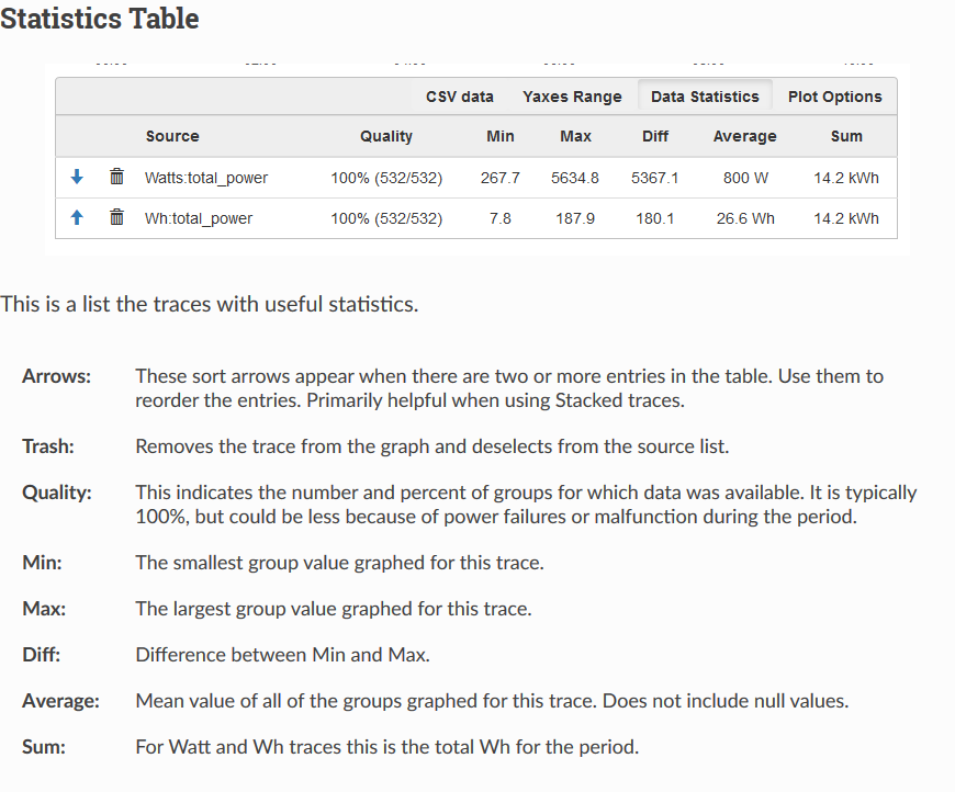
From browsing the forums here I’ve gathered that the Graph+ implementation is doing grouping/averaging before plotting or doing the data statistics (something which I did not notice was happening / changing automatically based on the start/end time range selected). This makes the graph and metrics quite inaccurate and misleading. For example:

“What is the peak draw of this device?”
If you happen to select a period covering several days, you might get a “Max” value of 985.7 watts. But if you zoom in on a random peak of that graph, then you suddenly get a “Max” of 1300.3 watts. That’s a massive difference, on the order of a 25% increase, and can lead to very incorrect assumptions about the power draw of devices.

I’m sure the grouping is done to increase the speed of graphing and reduce the cpu/memory overhead for large selections. That said, if the ‘group’ is anything larger than 5 seconds, then the term ‘Max’ ‘Min’ and ‘Diff’ are misleading and inaccurate. Is the ‘Average’ and ‘Sum/Integral’ accurate? How can anyone trust the data statistics or graph numbers?

My frustration stems from having handed out bad advice for the peak power draw of several devices due to the mishandled graphing and statistics. I bought the device to get accurate data, so when the graphing software is directly misleading, that negates a lot of the benefit and forces me to export all the data to something like InfluxDB/Grafana just to get accurate data representation. I really like the features of Graph+, and honestly prefer it to using Grafana, if only it were actually accurate over any large time period.

Can I override the ‘group’ setting and always force it to use 5 second intervals?

Graph+ uses query to retrieve the graph data points. When you query Wh, you get total Wh for the group, everything else is average for the group. When you produce a plot with Graph+, it makes a query and then plots the data points (groups). So if you are plotting watts for a day, you will be getting 2 minute averages.

That would depend on how it’s represented. Take a look at the Graph+ documentation. Here is an excerpt. Note the description for Min, Max, Diff and Average. I don’t think it’s misleading. It may not be what you want, but it is what it’s represented to be.

What’s your definition of “peak draw”? IoTaWatt samples each channel about every 500ms or 30 AC cycles (60Hz) and considers that representative of all the cycles since the last sample. So if you want to know if one of those 29 or so cycles is greater or less than the sampled cycle, it is unknowable. IoTaWatt further time weights those samples to produce 5 second averages. That’s what is saved in the datalog. So even the 5 second data actually represents about 300 cycles, any one of which could be significantly higher than the average. Inrush current to a motor could be 20-30 cycles.

Yes, speed is a consideration. There are 17,280 datalog entries for a day. Query will read only 721 to produce a daily graph of 2 minute averages in about a second. To process all of the 5 second entries, it would take about 10 seconds. While that is happening, IoTaWatt isn’t sampling your power. So it’s not just time, it’s a tradeoff to defer to the prime mission of sampling and recording power.

As above, even 5 seconds is misleading in your context.

Yes

By understanding what they are.

As above, the data is accurate as described. In fact, it’s very accurate. Grafana will allow you to query the Min/Max of the 5 second data. Running it on a multi-core Rpi with fast MMC SDcard, and a lot of memory will be more performant that the IoTaWatt.

You can do that with query in the latest release. It will dim the lights for awhile depending on the time period. You can feed it into a spreadsheet and use the min and max functions there.

Just curious, what exactly do you like about Graph+ that you prefer it over Grafana?
I have used both and did the initial implementation of the time period selection that Original Graph uses and (it looks like) Graph+ inherited, I copied that from what I liked about what Grafana does, but Grafana does that much better.

I find Grafana is pretty easy to get started, but there is a LOT to learn and usually more than one way to do things, so it can be intimidating. As I have used it more and looked at dashboards that others have created, I am starting to learn the power of templating.

Now, back to your question “peak draw on this device”. I had that question for my total load. I have two IotaWatts so I had to wait for Flux support for InfluxDB to be able to answer that. I am only using 10s data from IotaWatt, so it may not even answer your question, but it is fine for mine. Here is what that looks like:


Now, I have InfluxDB and Grafana running in separate LXC containers on a Intel i7 that is significantly more powerful than even a RPI 4 (and probably several orders of magnitude more powerful than the esp8266 in IotaWatt). The day (24hour) queries refresh instantly (probably less than a few hundred milliseconds). The 30 day query takes about 10s. The 6 month query takes about 30s to get the data. For the query, InfluxDB has to visit all the points to figure out the maximum. Assuming 10s data, that is:

6*30*24*60*60/10 = 1,555,200 points

I have two channels that it needs to calculate times two expensive operations (W and A). It then has to combine the two channels (at a reduced number of points) to get the max of the channels. Grafana then has to figure out the maximum of this reduced set of data. If I needed this data regularly, I would probably set up some continuous queries to reduce the search set, i.e. downsample the data to get the interesting bits. But, since the query for 6 months returns in a reasonable amount of time, I will probably leave it as it is.

IotaWatt is a data collector that offers some ability to graph the data. I used it this way for years, since it works really well for simple questions. The true answer to your question is computationally expensive. The esp8266 is not a good choice to answer that type of question.

  • the eagle eyed, will notice that a peak of 28.5kW should be more than 68A. This is likely because there are a handful of bad data points in the data set. I haven’t looked closely yet to see exactly what.