Innacuracy or did I do something wrong? - resolved

I don’t know if this is an issue with my setup or if it’s just showing a slight inaccuracy in the sensors. I have this graph set up with Total_Power measuring my main leads, All_Combined as all of my other circuits combined together, and All_Difference as all of my circuits minus the total power, which should be 0, but it’s showing that all of my circuits combined are drawing more power than my total power. Does this look right?

Looks as if there might be something misconfigured, but will take a little investigation to figure it out.

First, can you include the data statistics display with the graph so I can see the difference in kWh?

Can you show the inputs setup display so I can see what you have configured?

It appears the difference is more prominent in the two large spikes around 5kW. Can you plot the individual circuit responsible for that along with the total power and combined and plot that for about an hour or two? (You can zoom in on a portion of the graph by selecting a vertical section with the mouse.

I’ll probably have more questions once I see that data. I don’t expect the difference to be zero, but it should be very low. By way of example, I don’t have everything measured, but when I subtract what is measured from the total, I get a pretty flat line:

The little blips are the garage door opener and the larger spike at noon are the garage lights. Other than that, the loads are constant - controls, radon fan, etc. and are a steady 105W, even though as you can see there is a lot of volatility in the overall load.

here’s the data.

My naming scheme for the inputs is [letters that are my own labels][Input number][Crappy description][The number of the breakers that are being measured]. I skipped a breaker where I could so the wires are on the same phase and I reversed one wire where I couldn’t skip so I believe all the single breakers are correct even with most of them having 2 wires through the sensors.
Inputs 3, 7, and 13/14 are all double breakers.

Input 3, the Dryer, has both wires with one reversed.
Input 7 is the oven, which has a neutral wire but I didn’t have enough slack to reverse one wire so I’m only measuring one and using the ‘double’ function which I know isn’t recommended in the docs.
Inputs 13/14, are going to the garage and have one sensor on each wire, one facing in the opposite direction.

The spikes at 21:00 on the 9th and 14:40 on the 5th are the dryer and a lot of the smaller spikes are the oven, like 6:40 and 19:20 on the 8th and 16:40 the 9th and 17:20 the 10th.

So I’m thinking I might have to buy another sensor to put on the oven circuit and combine them with a headphone splitter to get an accurate reading but the dryer should be reading accurately, right?

It looks as if one of the mains may be reading low. I see that you have the 200A clamp-on CTs. Those are manufactured with small squares of paper between the mating surfaces in the jaws to protect them against chipping and corrosion during shipping. They usually just fall out during installation, but sometimes one of them doesn’t, and it throws off the reading. Can you check those clamps, especially the inner surface, for a paper spacer?

I do remember when installing them that one had the paper square, which I removed, and one didn’t but I went ahead and double checked and there isn’t anything in the clamps. I made sure that the contacts were clean and the clamps were fully closed as well.

OK, lets take a different approach.

Would you plot wH for:

A1_Main1
B2_Main2
C3_Dryer_1_3

from 21:20 to 21:30 on Oct 9?

Nothing else

Oh, while you have that plot, could you show the CSV data and copy/paste it as well. Should be 120 lines. There is a button to copy to the clipboard.

So I think removing and reattaching the clamps actually fixed it, even though I couldn’t see an issue with them before.

Here’s a graph showing the last 3 hours of usage.


You can see at 19:00 the two negative spikes in the Total_Power line, which is where I was messing with the clamps. After that the difference between the main leads and all the circuits combined is minimal. I even ran the dryer for a minute, at the far right of the graph, and the difference is only a few watts.

I’ll keep an eye on it for a while but I think that’s solved it!

Looks good. Nobody has ever posted a complete reconciliation like this before. I’ve seen a lot of “misc” plots that are close, but no complete comparison of the mains vs the aggregate. If you don’t mind, could you post the total, sum and difference in a day or so when you get past the erroneous history? Please include the data statistics along with the plot. A lot of monitors can do a pretty good job of the mains, but I think it’s a good indication of the accuracy of the individual lower power circuits when they add up very close to the total.

UPDATE: I’m looking at the little blip at about 19:32. It also shows up on the combined but doesn’t seem to be in the mains total. That looks like maybe something to do with the three-wire range. Can you identify the individual circuit causing that blip?

Sure will!

I think that blip was the well pump kicking on. And the smaller one at 19:29:30 was “h8_WaterHeater_16_20” which the water heater is gas so it could be the vent fan motor for it but also the sump pump and some other small things are on breakers 16 and 20 (I have no idea what’s on 20 actually)


You can see the well kick on again at 20:54

And I ran the water to get it to kick on again just now

I think that’s caused by the way IoTaWatt samples the circuits. With a full slate of CTs, it samples each circuit about once every 350ms. Those samples are time averaged into 5 second measurements. The aberration is a single measurement that occurs at 21:43:50. Everything is in agreement 5 seconds before and after. So it matters when each of the mains (usually consecutive) and the pump are sampled with respect to when the pump comes on. Sometimes the mains get an extra “on” sample, and sometimes the pump does. The impact on kWh is miniscule.

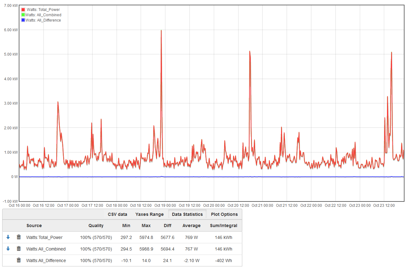
Here’s my last week of data. As you can see the difference between the readings from the main leads and all the circuits combined is minuscule.

0.3% - that’s amazing!

@GrimResistance,

The weekly summary is very interesting, but the weekly plot is based on 20 minute averages. I’d like to get some different perspectives on this with the same plot for a day (2 min averages) and an hour (5 second averages).

Would you post those plots please? Thanks.

Sure. Here’s today


and the last hour

1 Like

Thanks. Closeup that looks as good as the weekly, except for the sample timing spikes when big loads switch on/off as previously explained when the interval is 5sec. The kWh variance remains low at <0.5%.