That answer’s right in that there is averaging going on, I do have to argue the point that it isn’t a truly accurate picture.
First, lets talk about the primary data. IoTaWatt has a log with 5 second resolution. Those 5 second measurements themselves are the millisecond weighted average of typically ten discrete measurements, taken about half-second apart. So the 5 second measurement is itself an average.
When the graph program requests data from the IoTaWatt, it specifies a time span and an interval. In responding to those requests, IoTaWatt again time weights the 5 second intervals and returns the averages.
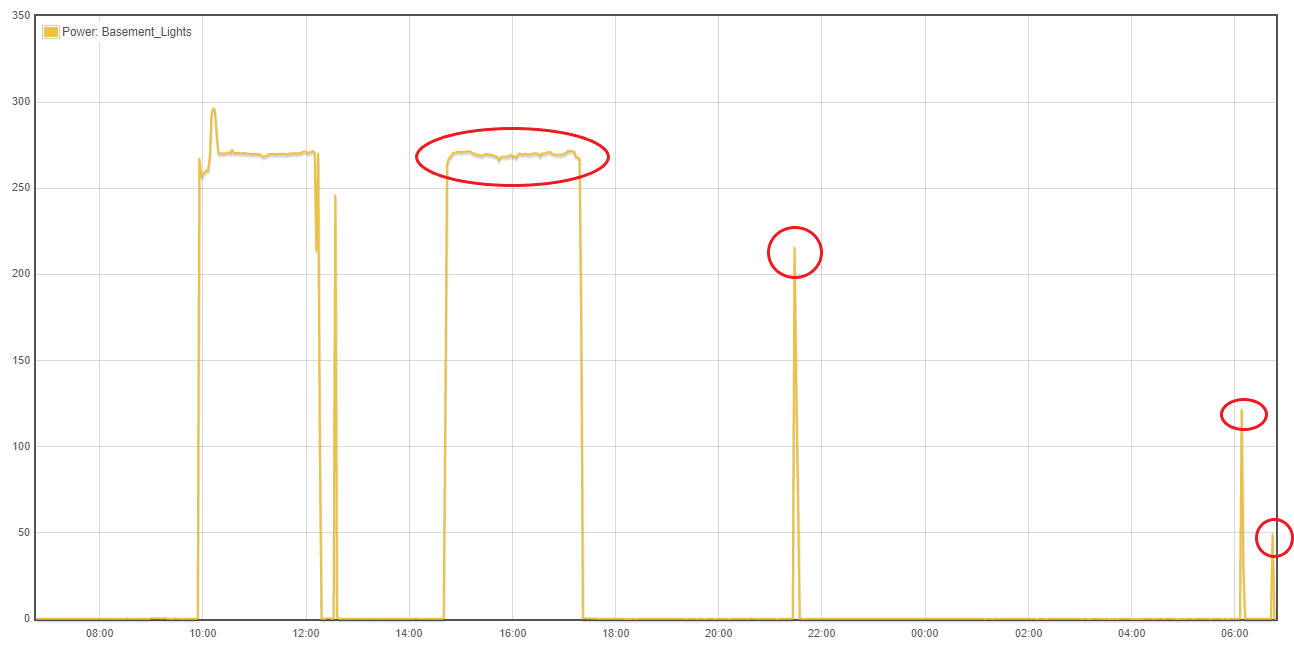
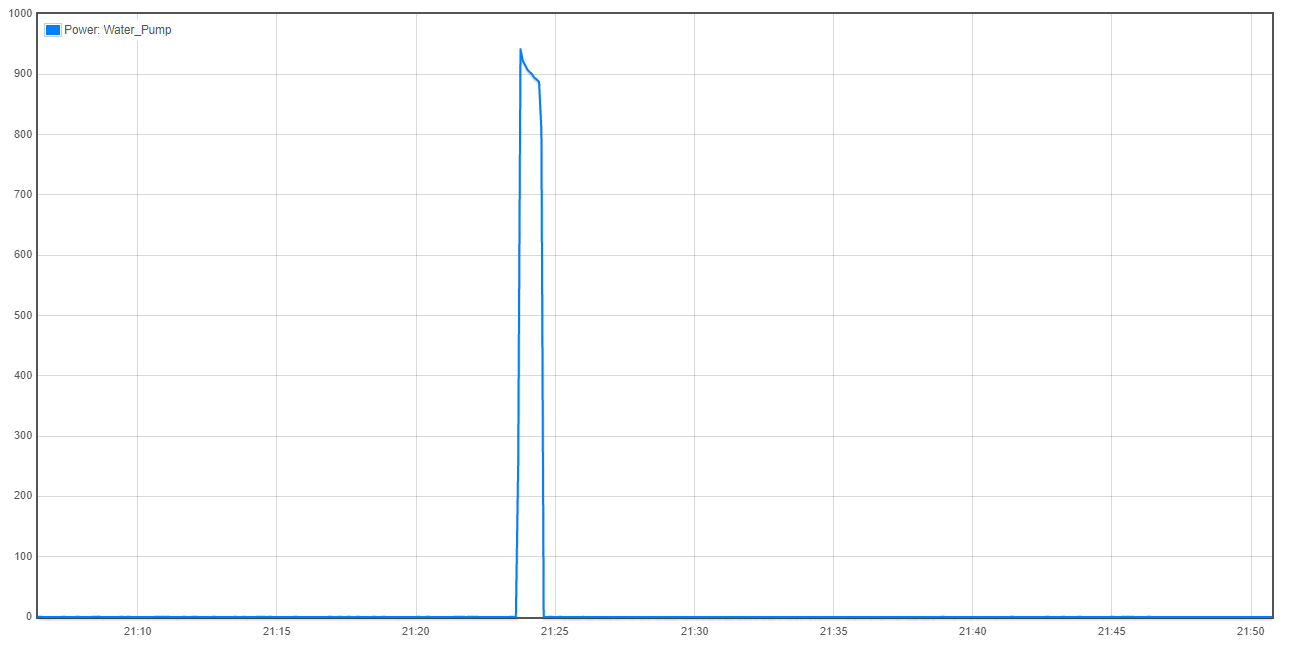
Consider the first graph presented above. It covers a day’s worth of power. The interval in the graph is not shown in the screenshot, but it should look something like this:
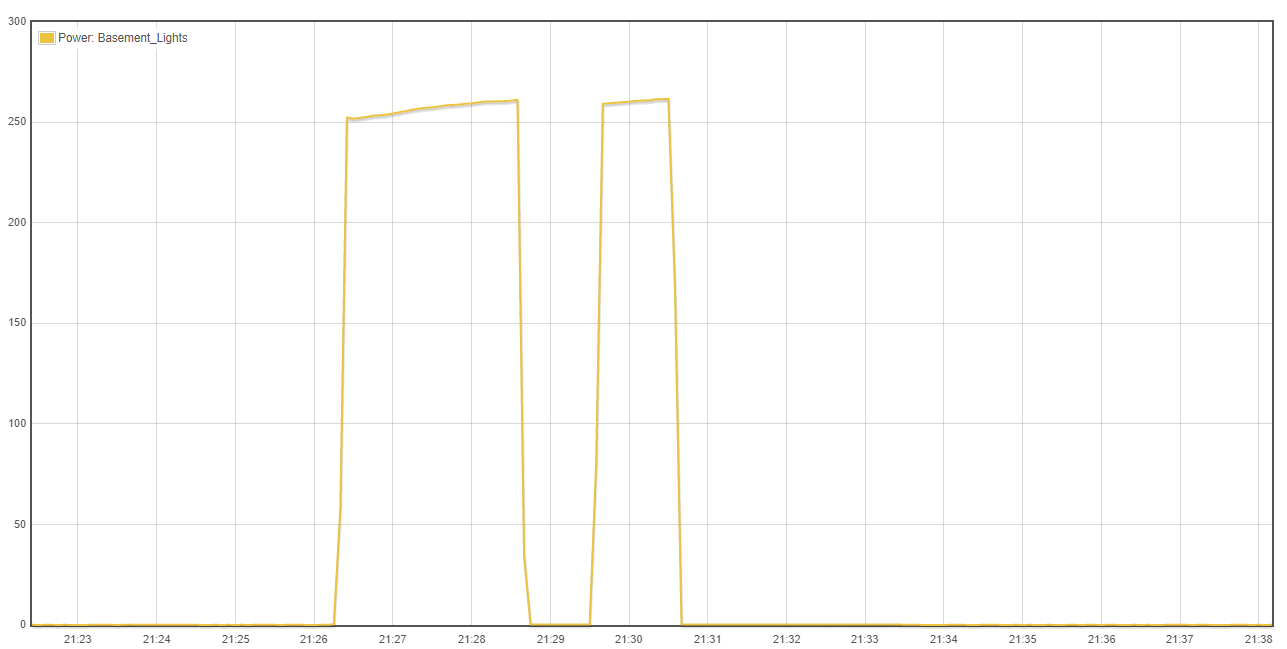
Each interval is 120 seconds, or two minutes. In the case of the basement lights at around 06:20, we can see that there is a cycle from about 21:26:15 to about 21:28:45. That’s more than 120 seconds, but the intervals are divided evenly, so this cycle would appear in the 21:26:00 - 21:28:00 interval, and in the 21:28:00 to the 21:30:00 interval. In the case of the first, that’s about 105 seconds out of 120 seconds, so
250 Watts x 105 / 120 = 219 Watts.
That’s pretty much what the daily graph shows. When you look closely at the high resolution (small interval) graph of that same cycle, you can see a small change in slope at about 50 Watts, both on the way up and down. That’s because the cycle actually started there and the 5 second intervals that lead and trail the cycle average to about 50 Watts (1 second on 4 seconds off).
It’s all consistent. I would have to ask: Why is this not a truly accurate picture?
Now the backstory. This graph module was ported from the open-source Emoncms system. Emoncms takes a completely different approach to how it reports this data. In response to the same daily query, Emoncms will report the power at he time of the interval. If your feed is a 10 second feed, which most are, you will get a plot of the ten second averages sampled every 120 seconds.
That’s with IoTaWatt sending the data, because if the posting is ten seconds, it will send a ten second average. When Emoncms gets the data from an EmonTX, it is simply the average of some number of consecutive cycles sampled during the period. The newer so-called continuous sampling firmware will include most of the cycles, albeit at lower resolution, to provide more of an average. They might argue the true total usage. Whatever.
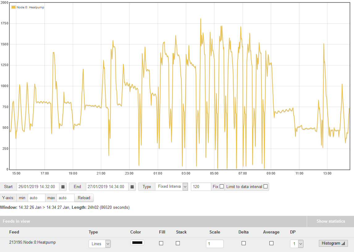
Now, Emoncms provides the ability to average as well, but you have to ask it to do that by checking an average box. Here’s my heat pump for a day taken from Emoncms without averaging:
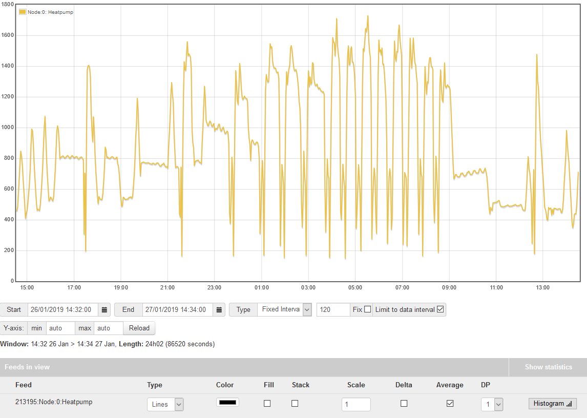
Now with averaging:
It’s subtle but notice the defrost cycles during the wee morning hours. The non-averaged method shows greater swings as it reports some zero usage 10 second intervals and the peaks of the cycles have a different profile. With averaged values, there are no 120 second intervals with zero power, they bottom out at about 200 Watts average.
Here’s the IoTaWatt with the same intervals. It matches the Emoncms average presentation.
So the average checkbox is an artifact of Emoncms graph left in the IoTaWatt variant that needs to be removed. IoTaWatt always averages. It is a natural result of the way IoTaWatt stores historical data vs Emoncms. By storing a single cumulative watt-hour value for each 5 second interval, IoTaWatt is able to report the 5 second value, the average between any two intervals, and the kWh usage between any two intervals. With Emoncms, you need to have both power and kWh feeds, and if you want averages, it has to read the individual intervals and average them.