Consumption does not equal import+production-export

I’ve just installed IoTaWatt, and it’s awesome. Thanks so much for all the hard work on the hardware and software. So much better than the Solar Analytics I also have installed.

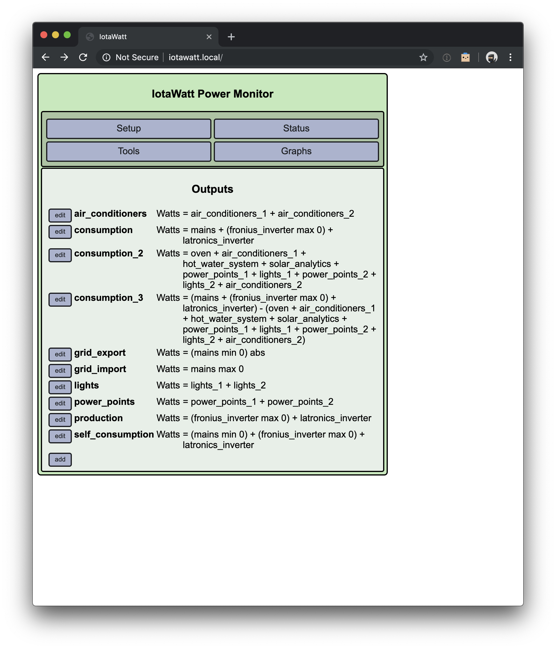
I have two inverters and net metered mains, and I have placed a CT clamp on every sub-circuit (oven, air conditioners, hot water system, solar analytics, power points, lights).

The fronius inverter consumes ~11W in standby overnight to monitor consumption, so I’ve used the min/max output functions to get positive values for:

  • total consumption – mains + (fronius max 0) + latronics
  • grid export – (mains min 0) abs
  • grid import – mains max 0
  • solar production – (fronius max 0) + latronics
  • solar self consumption – (mains min 0) + (fronius max 0) + latronics

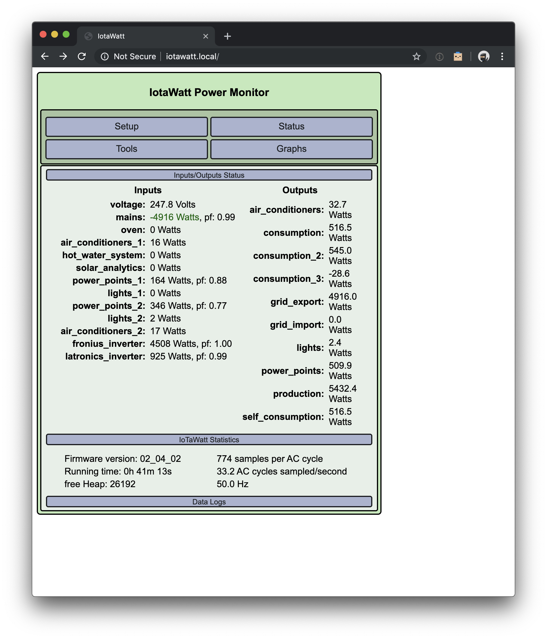
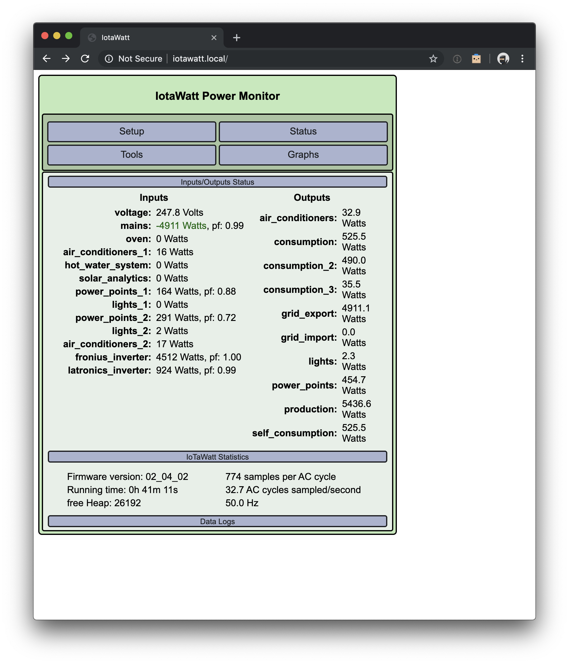
When I look at the outputs, it seems to all add up perfectly.

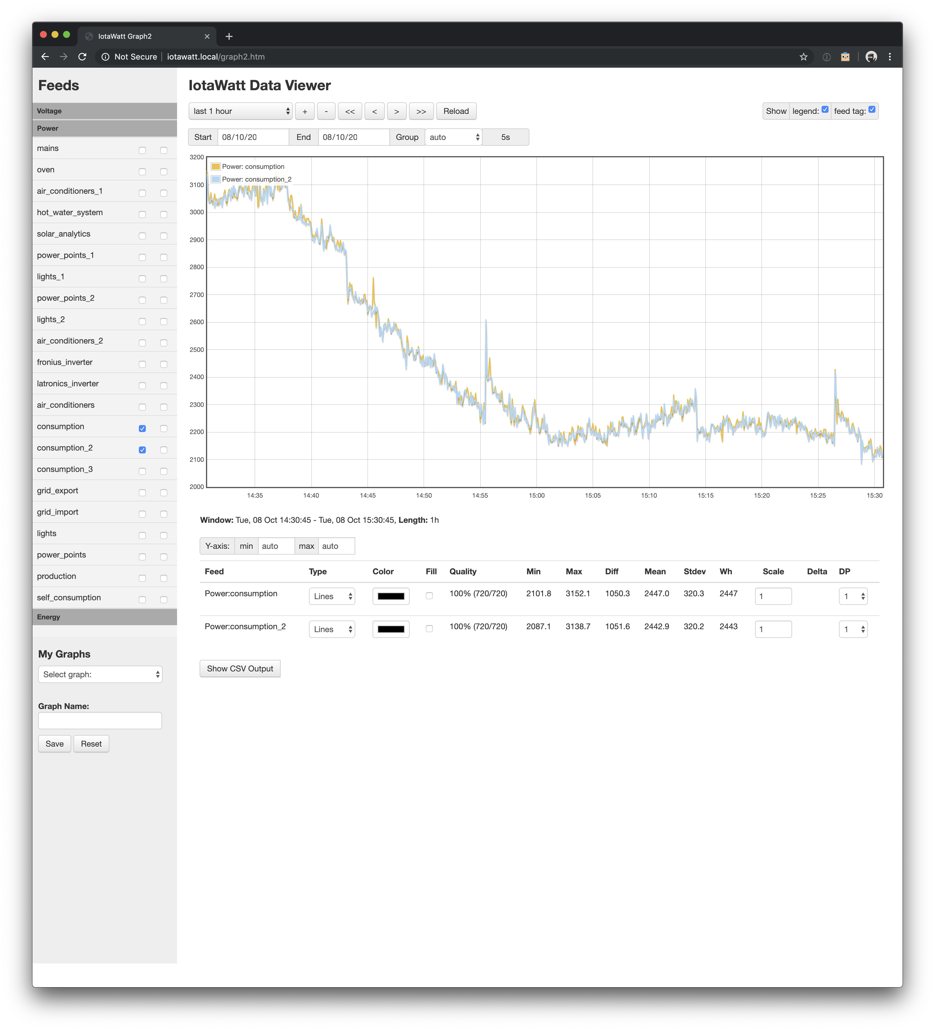
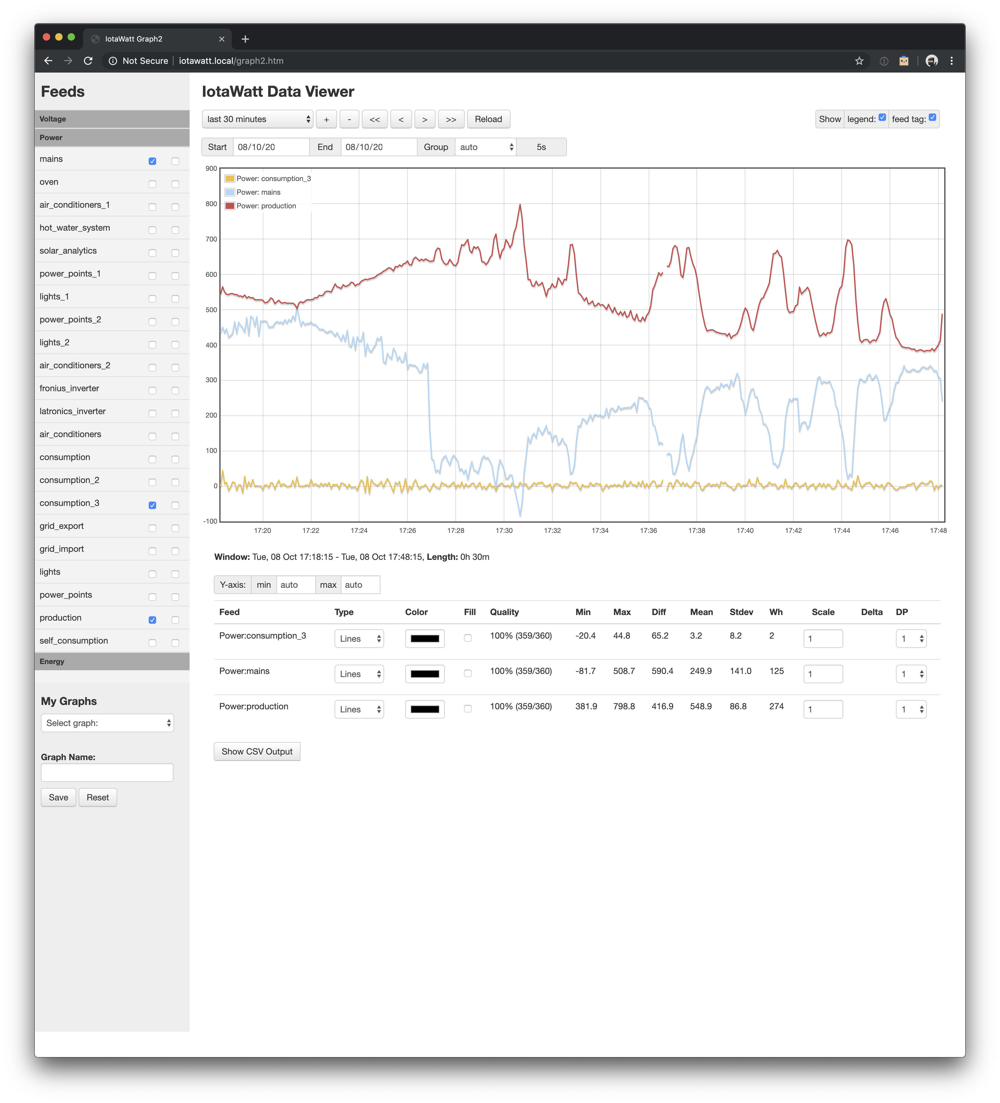
But then I created another output to measure consumption of the measured sub-circuits directly (consumption_2). This did not add up to “total consumption” as I had expected, and the difference was not a steady value.

So then I created yet another output (consumption_3) to show the difference in real time (consumption - consumption_2), and the value is quite volatile, swinging from about -40W to 40W.

I’m at a loss as to how to explain this. Any tips?

Hi Mr Machine, id like to get a better feel for the dynamics of your setup. The variation is less than 1% of the total power, so this may just be an issue with damping.

The status display metrics are damped so that you get an idea what’s going on without things jumping around excessively. So if these inputs and inverters are changing, the damped values will not necessarily be zero-sum.

The graphed datalog values are more of an exact snapshot of everything. I’d prefer to lookf at this problem through that lens. So could you use the graph program to plot consumption and consumption2 over, say, the last hour? When taking the screenshot, try to include the statistics line below with the total Wh of each.

After that, adding the two solar inverters and the mains to the two consumption might shed some light on the extent of the volatility and how that might be affected by the damping.

@overeasy Thanks for your reply and advice. The total Wh is 2447 vs 2443, and the overall trend of the graph does look not too dissimilar. But is this graph still showing some damping? If the graph is showing more of an exact snapshot, shouldn’t there still be less deviation at each moment?

We’ve just had a power outage so I can’t get the second screenshot with mains and inverters added, but I’ll try to do that later. Do you mean sum them with consumption 1/2, or just plot them on the graph at the same time?

UPDATE: I had previously read in a few posts that the numbers won’t always add up perfectly, but it seems that the numbers between net mains and the two inverters do pretty much add up perfectly on the status page.

I wonder why the sum of monitored sub-circuits would be any different? Even if it’s less than 1% of total power (including production), the first method of measuring consumption appears to be a lot more stable than the second. +40/-40W seems like a big variance on ~500W consumption, even though there’s a lot of export happening alongside that (not measured in the consumption_2 output).

Perhaps it has something to do with the number of damped inputs being used in the output (9 for consumption_2 vs 3 for consumption)? More damped inputs causing more overall volatility in the calculated number? Or is the output as a whole damped at the end rather than damping each input?

Here’s another screenshot (for a different time period, because I’m not sure how to get back to exactly the same 1h window, it only lets me enter a date) showing consumption, consumption_2, mains and the two inverters.

This graph shows a difference of about 5Wh, and mains + inverters being 1Wh off the consumption (more stable) value. I’m not sure if this is what you wanted?

I’m glad both methods are pretty much equivalent and accurate over time (energy), but does this mean that at any given moment when I look at consumption it may be -40/+40W off actual (on 500W), regardless of the method used?

Here’s a video showing the volatility of all the inputs/outputs (rather than me trying to describe it):

I wasn’t able to upload the video directly, so it’s a Google Drive link.

UPDATE: Here’s a screenshot showing consumption_3 (the difference between the two methods) over half an hour, with mains and solar production, while solar production is winding down and we’re (mostly) no longer exporting to the grid.

Variance is -20/+44. Over the 30 minutes, the total variance is only 2Wh from ~400Wh (import+production), but at a given moment chosen at random it was +24W (difference) from 700W (import+production) which is 3.4%?

UPDATE 2: Watching the status page again now that the sun is down and solar production is zero, all circuits (except for power_points_2) are completely stable, and power_points_2 and mains are moving a little with each update. Sometimes the movements are similar, but sometimes they are quite different and even moving in opposite directions. E.g. from one second to the next mains was +1 but power_points_2 was -10.

I think you’re right that this is just the damping at play, and over time it does appear to be the same trend line and same cumulative result. But it is curious, and I’d love to know how the damping can cause movements in the opposite direction like this. And I wonder if the damping can be tweaked, or if showing an average over 5s would smooth it out with less variance. But I’m sure you’ve already done that to get it to this point.

Perhaps just a warning on that page that individual inputs and outputs are damped to avoid wild jumps and as a result, there’s a +/-x% or +/-xW margin of error for instantaneous readings and therefore calculated outputs, would save you from having to answer the same question again and again :smiley:

Short answer is no. That’s not to say it’s better or worse, just that what you are measuring does not support that conclusion. What you are doing is comparing the mains CT to the sum of the individual CTs on the load circuits in a roundabout way that, in the case of using the status display, introduces more variance with the two inverter outputs.

It’s unlikely that the sum of individual loads will exactly match the main. The CTs are just not that accurate. They are supposed to be within 1% but they also have some amount of non-linearity. You could better compare the two methods at night when the inverters are idle (accounting for their standby load).

As an energy meter (as opposed to a power meter) IMO the results are stunningly accurate. 5 Wh out of 2,760 is about 0.2% difference. This is in an environment where the inverter output is varying between 2000W and 4800W and the power through the mains is varying by the same inverse amount. I guess it depends on your definition of a moment. There is no attempt to synchronize the power readings of all channels, in fact, that is impossible because only one input can be sampled each 30ms. You really need to take a step back and look at the overall picture, which I think is amazingly consistent.

1 Like

I agree that as an energy meter it appears to be exceptionally accurate.

Your comment that only one input can be samples each 30ms is also clarifying. So we’re never getting a snapshot of all inputs at any given “moment”, and each input involved in calculating an output (e.g. the sum of mains and 2 inverters minus the sum of 9 circuits) will increase the window over which measurements are being made.

So 12 inputs * 30ms = 360ms window, and if mains was measured first and power_points_2 was measured last, there would be 300ms during which the power_points_2 circuit consumption could drop or increase.

Plus the damping. I’m still curious about how that works, not that I think there’s anything wrong with it.

I did watch it for a while with zero solar generation, and as I noted from one second to the next I did see mains go +1W and power_points_2 go -10W. But as you say, it is a flawed expectation that the status page is a perfect snapshot of a single moment in time.

I still think some help text on that page explaining at least that the sum of measured circuits will not match mains + solar generation. A little detail on why would also be helpful, e.g. because inputs are sampled sequentially and not instantaneously.

Thanks for taking the time to explain it to me here!

1 Like