Graphs showing very different max inverter production. Here’s the pics.
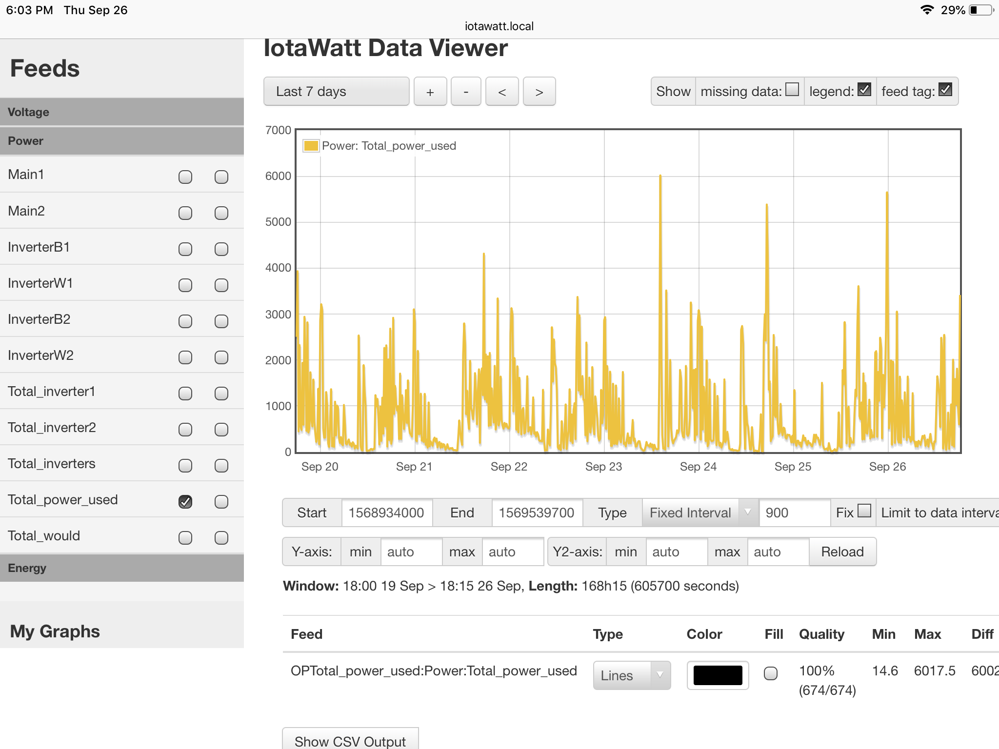
Just realized it does the same with everything the cts are on, here’s the pics for total power used
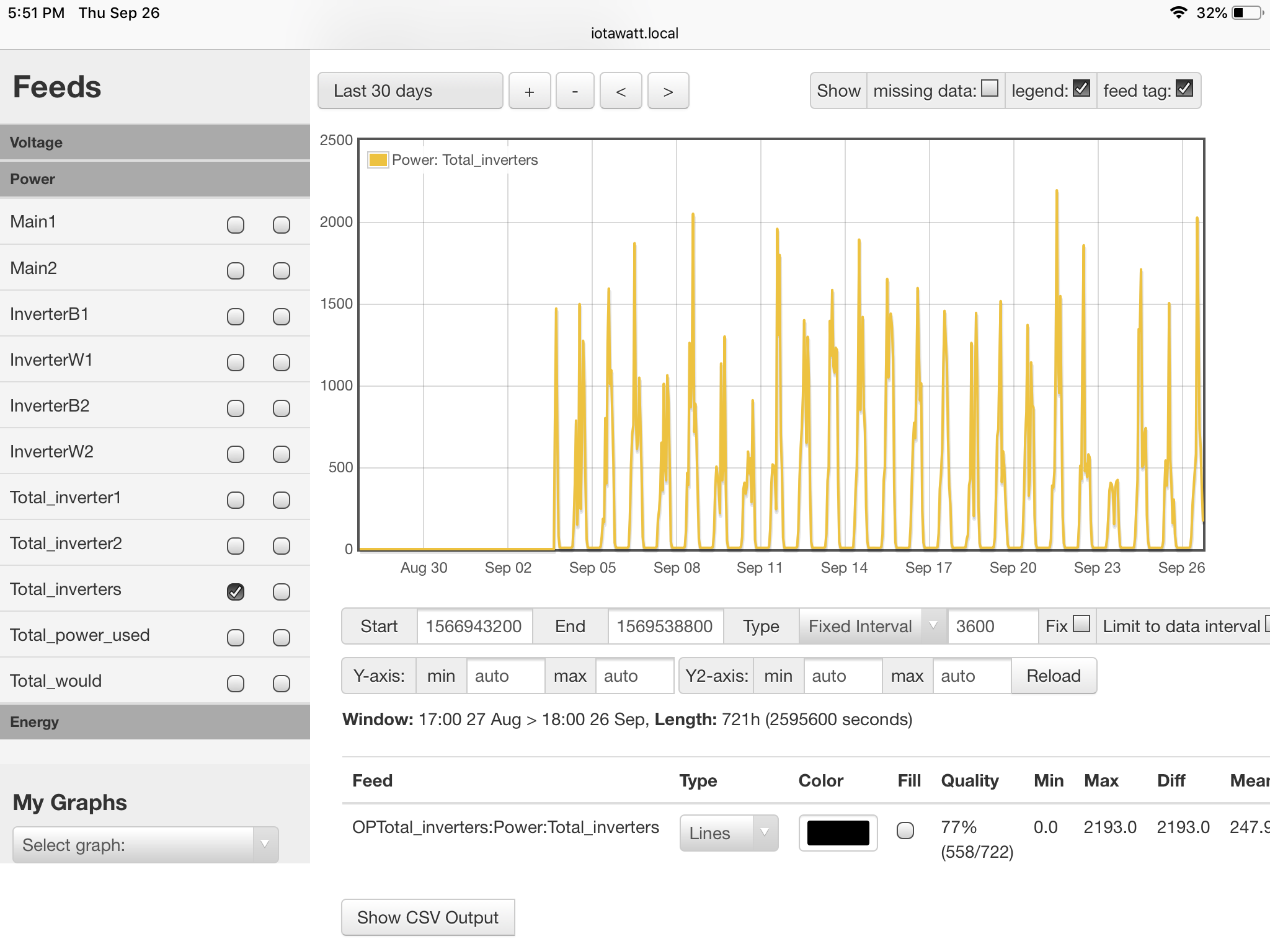


The graph doesn’t show max values. It plots the average power (or voltage, amps, etc) for each interval. So as the intervals get longer, the average power tends to trend down with cyclic loads.
In the case of your total-power above, the first plot of last 30 days has an interval of 3600 seconds - or one hour. So if a large ;load like a water heater runs for 20 minutes during one of those hours, it will contribute 1/3 of it’s nameplate power to the average for that interval.
When you go to last seven days, the interval becomes 900 seconds or 15 minutes. So that same 20 minute event can contribute up to 100% of it’s nameplate to that interval’s average power, depending on how it straddles the two intervals.
If you are interested in discovering maximum power for any particular time, zoom in until the interval is 5 seconds. That will cover about an hour’s elapsed time.
Other alternatives are Emoncms and influxDB.
With Emoncms the default mode for that 30 day plot is to plot the feed interval value, typically 10 seconds, for each hour. You may or may not be getting peak during that 10 seconds which is about 0.2% of the period.
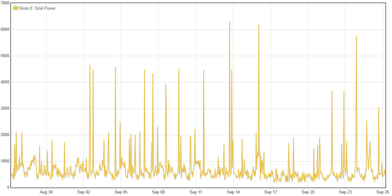
Here’s a month without averaging:
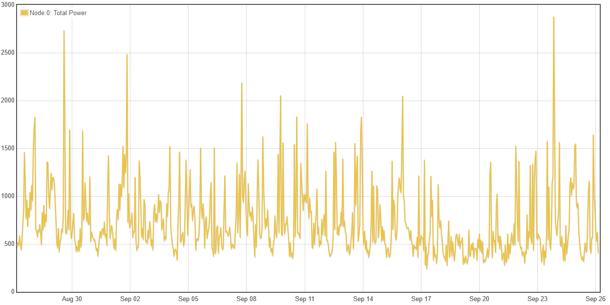
and here’s that same month with averaging:
With influx, you can actually plot the maximum (or minimum, or average) values for the each group (interval).
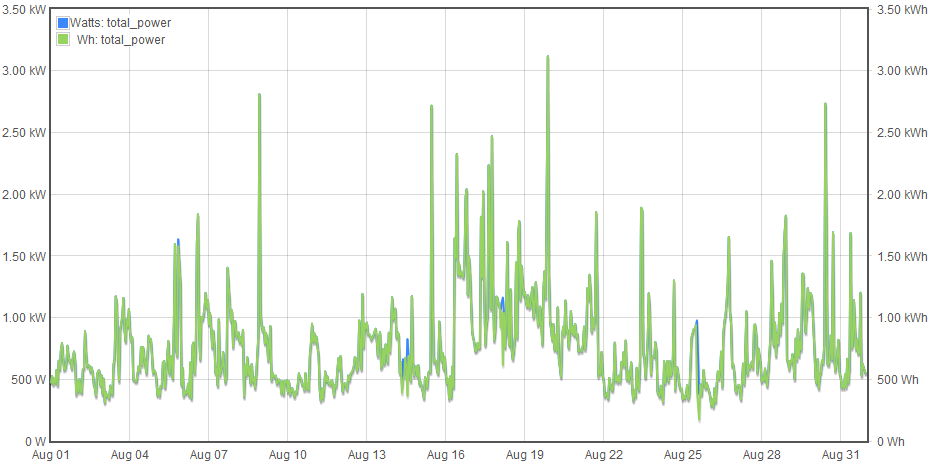
I don’t see the utility of graphing ten second samples each hour, or even each 2 minutes as in a daily plot. That’s why IoTaWatt always produces averages. Here’s a plot of both Watts and Wh consumed last month. If you are interested in how much energy you are using and when, the average Watts and actual Wh agree.
Last plot produced with the new graph program due to be released soon.
So where it says max below the graph isn’t actually max either… how many days out does it display the actual max power below the graph? So everything else is accurate when viewing more than 7 days out?
Let me rephrase that… Is the graph always showing the averages of the time interval? I was wanting to view my actual max power at any time that my inverters produced power during the last month… so to do that u are saying to click on the graph wherever I would assume (which I wouldn’t know) that the inverters produced the most, then use the zoom buttons above the graph?
If I wanted to view the max power my hot water heater used during any day, how would I find this easily? Well I guess I wouldn’t be concerned about the max but rather should be checking the total power the appliance used during a certain period of time… which I guess is part of what your working on. Thx for the clarification anyways
Right. The graph program reports average power used in each interval. The shorter the interval, the closer it will be to the actual instantaneous power. So yes, zoom in if you want to find that out.
The other alternative that I suggested is uploading the data to influxDB. That database would be hosted on a faster and more capable platform and has a query language to extract all sorts of things including actual min and max of the basic data interval (still 5 second minimum).
The IoTaWatt is spending 66% of it’s time sampling electricity use. That’s job one.