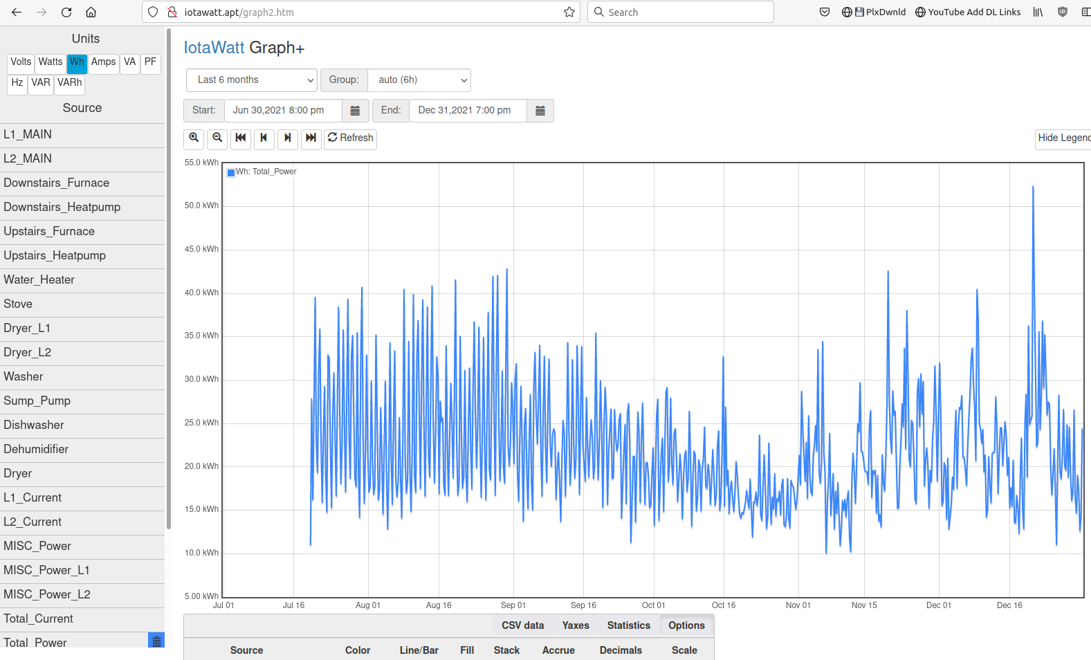
I’m confused how the Graph+ is supposed to work - I’m trying to see what the consumption of things are in units of time, but it looks like the kWH graph isn’t really going up at all as the consumption accumulates?
Graph+ of the “total power” for the house over the past 6 months (about how long I’ve had the IoTaWatt)
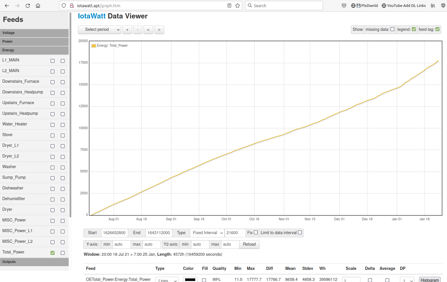
Ah, that made the difference - I wasn’t aware that was there (was off my screen and I didn’t think to scroll).
I do have to wonder though, how does not accrued watt-hours make any sense? That’s a measure of power over time, which I would think has to by definition be accrued since its over time?
query, and so Graph+, returns the total Wh for each interval in the period. In the case of your first plot, the period was the last six months and the auto-interval was 5 hours. So Graph + plotted your Wh use every 5 hours for six months.
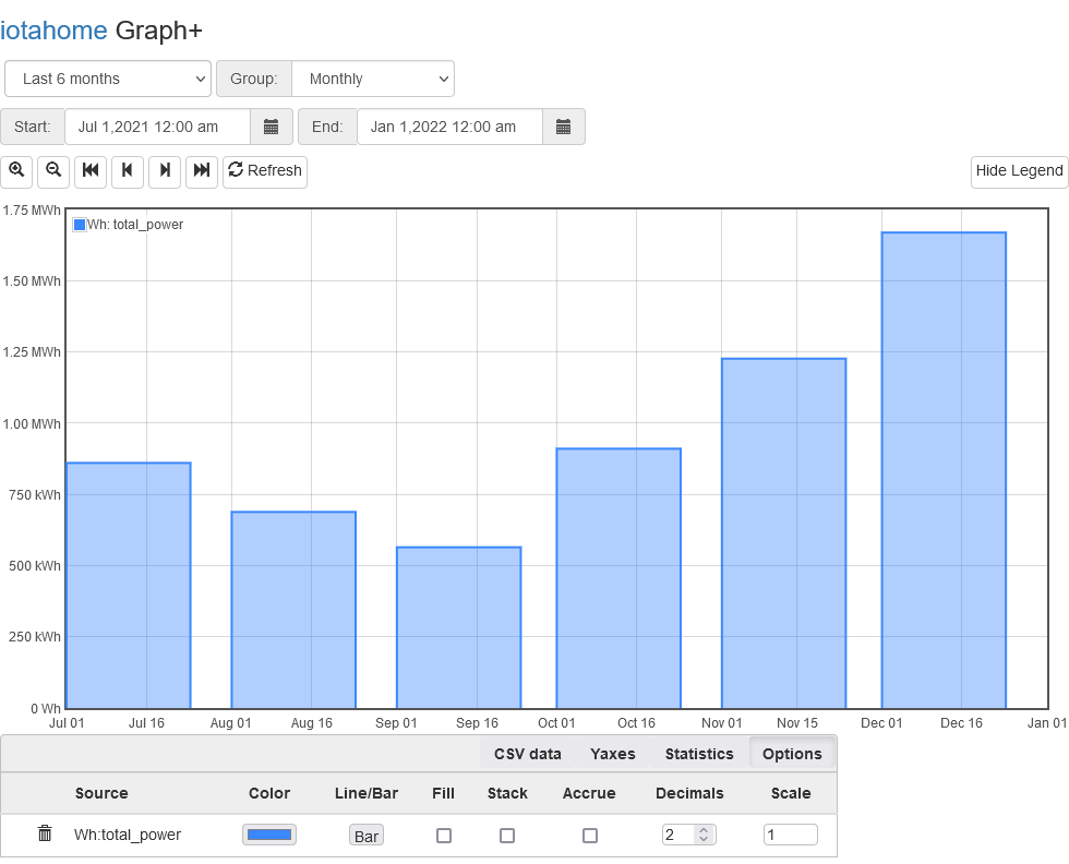
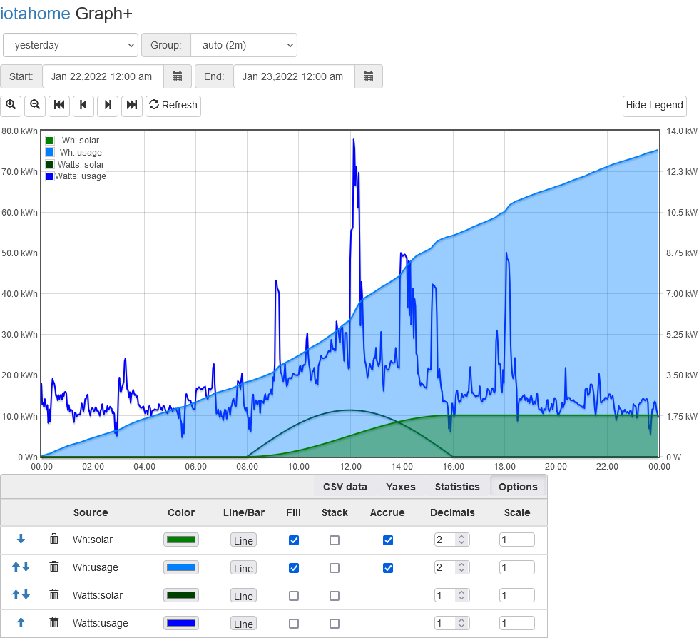
I think many users would find it useful, for instance, to see the daily Wh usage overthat operiod as in: