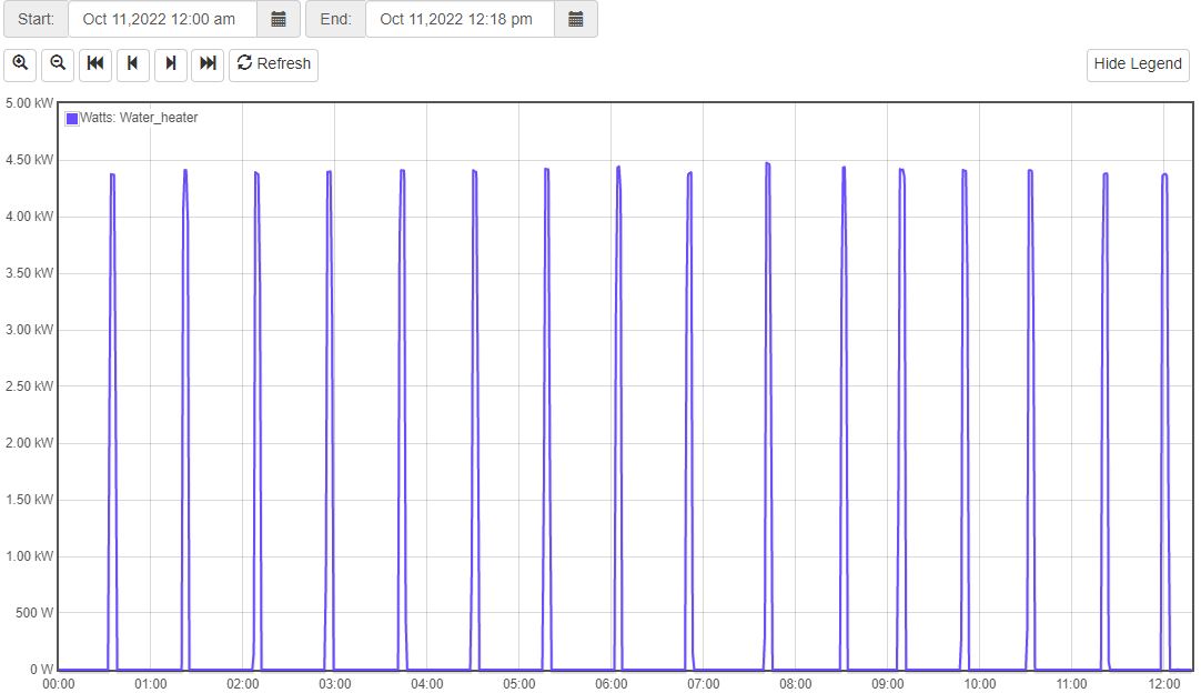
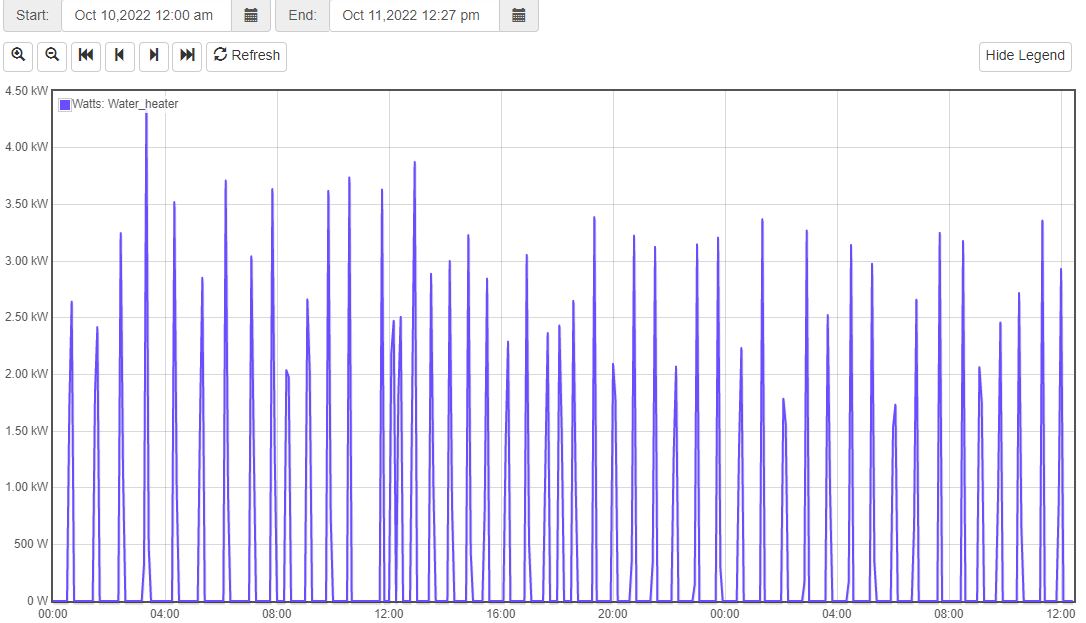
If I change the date range to yesterday and today, the peaks for today vary between 1.75 - 3.25kW. What am I not getting about this. The data for today is the same. Are the values different based on the date range. I’ve got to be missing something simple.
Graph doesn’t plot peaks. It plots the average for each interval. Your images don’t show the intervals, but you appear to have plotted about 12 hours in the first and about 36 hours in the second. Graph tries to graph 720 intervals spread evenly over your time period. If you plot 1 hour, that’s 3600seconds/720 = 5-second intervals. If you plot 12 hours, that’s 720 minutes = 1-minute intervals. With 36 hours it’s 3-minute intervals. It looks like it’s slightly more than three minutes which will jump to 5-minute intervals.
The smaller the period, the smaller the interval and the more detail you get. If the water heater does not run for the whole 5-minute interval, the average will be less. Even if it runs for 6-minutes, if that is split between two intervals at say 2 minutes and 4 minutes, you will have 2/5x4kW = 1.6kW and 3/5x4=2.4kW.
Generally speaking, if you want to look at Watts, use a period of a day or less. If you are interested in usage, look at longer periods and either plot kW or use Watts but look at the kWh in the Sum/Integral column of statistics at the bottom.
Got it. And correct, I was including about 12 hours in the first chart and 36 in the 2nd. I’ll export the data somewhere and do some time-based calcs. Thanks for the quick reply.
New to the IotaWatt and so far so good. Very cool device.