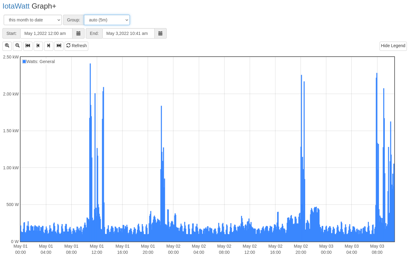
I’ve been trying to plot some consumption values per month, but I’m unable to get a correct value from Graph+, since it seems it uses a mean value instead of its max. For example, if I get a custom period (this month to date) with the auto grouping, I can see I’ve went past 2 kW mark a couple of times:
Graph+ always shows mean values for the given intervals. Even the basic five second data in the datalog is a mean value. So, at best, you can only get 5 second means from the datalog.
For longer periods, you would need to upload the data to an engine like influxDB whose query has the ability to find the maximum (and minimum) of the five second periods representing any larger intervals.
That is a big job. For instance finding the maximum 5 second mean for a day involves searching through 17,280 data points. For a year there are more than six million data points. The IoTaWatt, with its IOT processor and SDcard storage would take days to do that.
I was thinking on doing it with Graph+ since IoTaWatt has higher resolution than sending the data to InfluxDB.
Please correct me if I’m wrong, but my understanding is that IoTaWatt polls every second, while the value sent to InfluxDB is a mean value of the interval selected, so my concern is that the InfluxDB value could be lower than the actual power spike if its lower than 5 seconds for example.
Have you found any issue on evaluating max data over InfluxDB?
Graph+ and the influx uploader both get their data from the 5 second datalog.
You would need to define polling. The IoTaWatt samples each channel about twice per second in a fully configured system. Those samples are time averaged into the 5 second datalog mean.
The status display uses a different mechanism for it’s ~1 second display. Those are still averages, but captured every second or so. They are also damped values, so even a one second spike would have it’s value attenuated by hysteresis.
Bottom line is that IoTaWatt is not particularly useful for identifying min and max power at small intervals.