Hi again. I installed my new IoTaWatt last night and have a data visualization question. I’ve got a pair of 200A CTs around my garage subpanel mains and I’m interested in seeing graphically how much kWH I’ve consumed over time for that day (i.e. resetting back to zero each day).
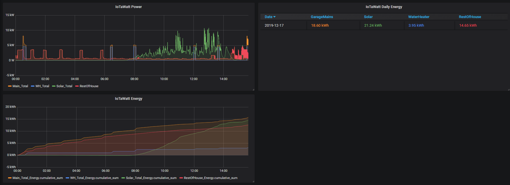
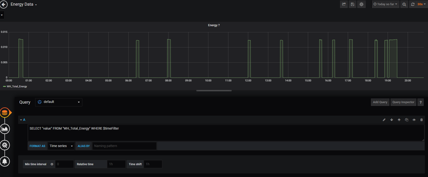
I’ve set up a panel in Grafana that shows what kind of shape the graph might look like (i achieved this by using a cumulative sum of energy formula), but the values are off.
My power (watts) measurements seems to be on point, and my single-state kWh calculation seems to be accurate (matches Iotawatt delta calculations), but I can’t figure out the best way to show the graph on the lower left side that represents energy accumulation over time.
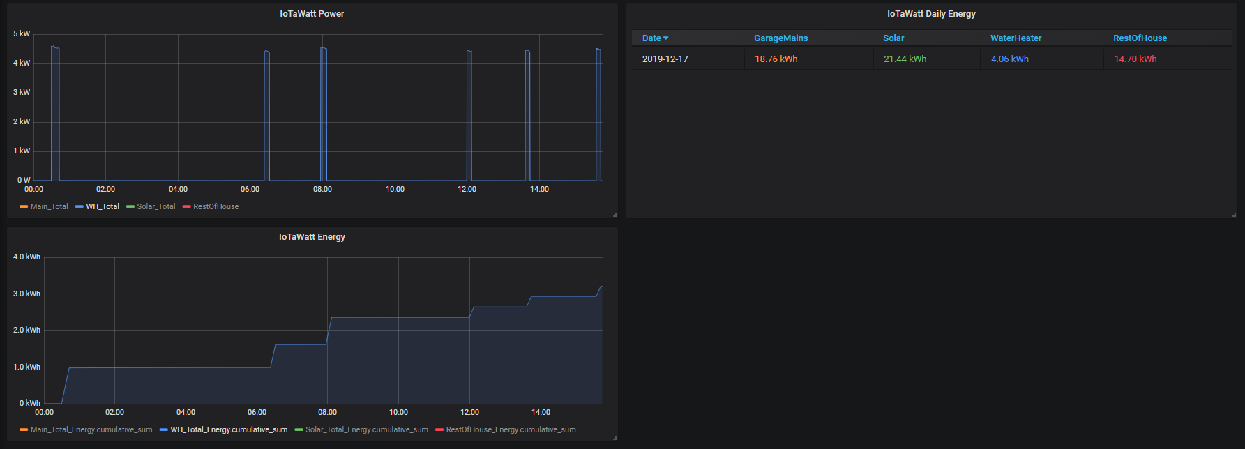
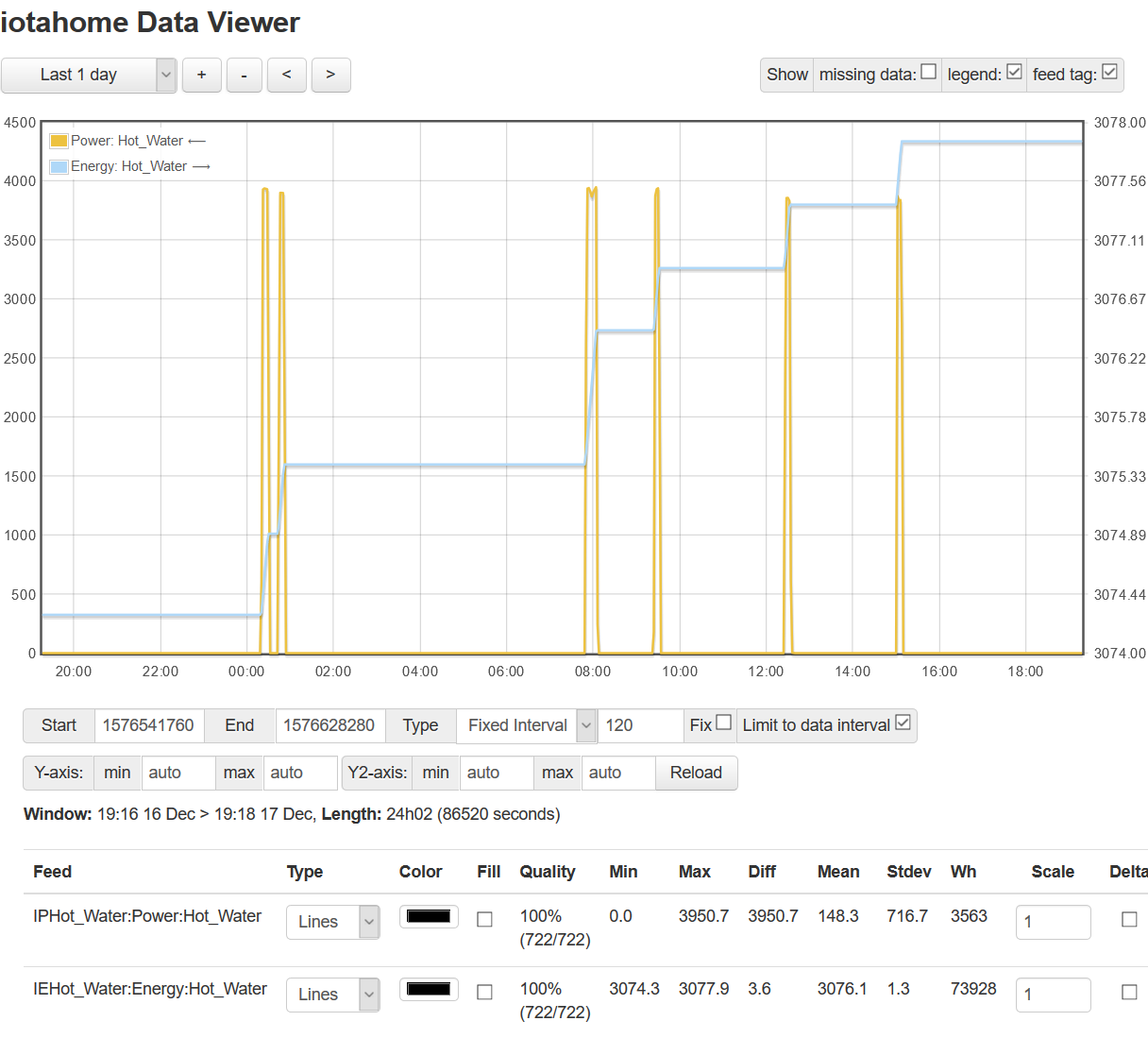
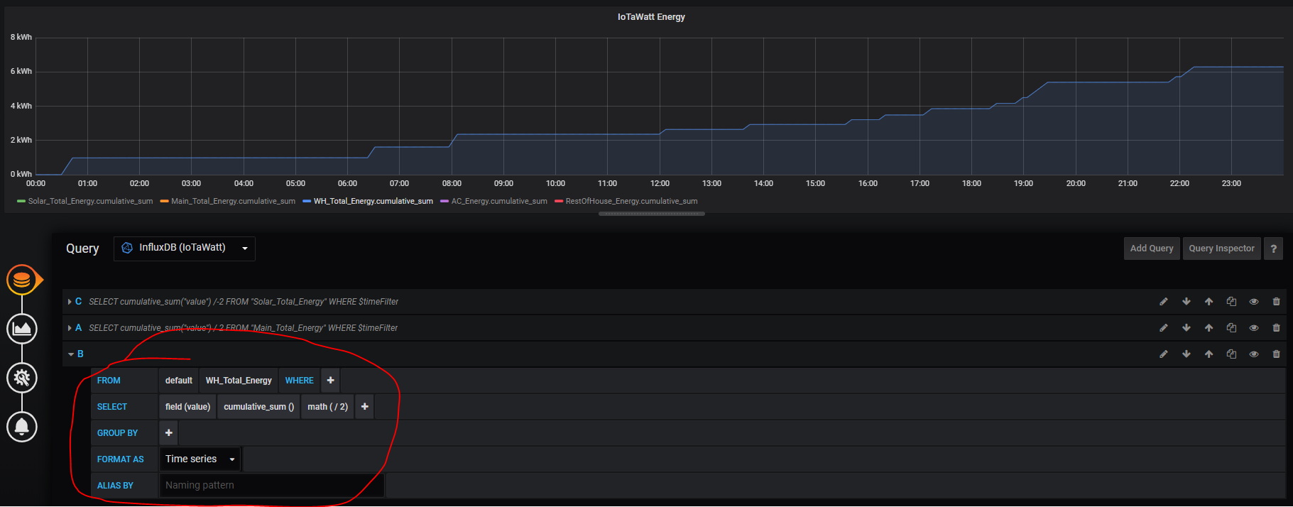
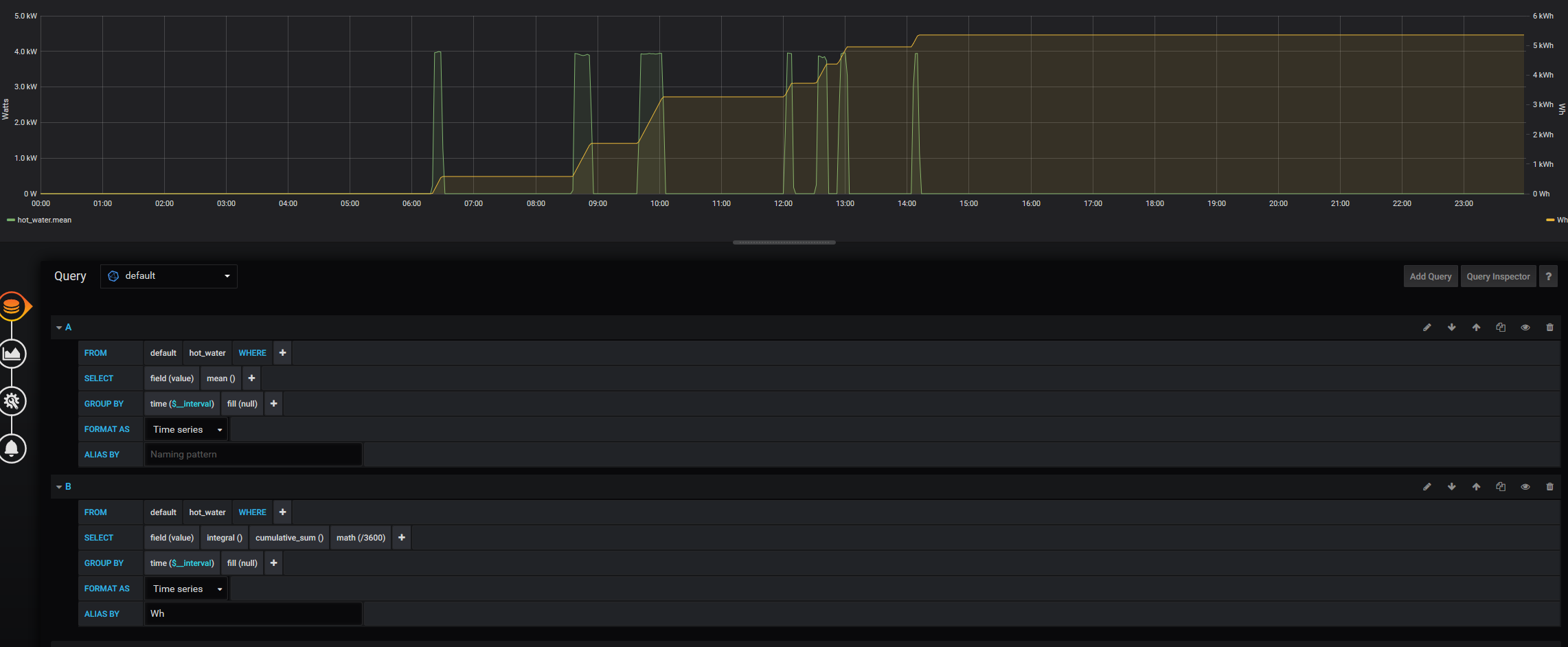
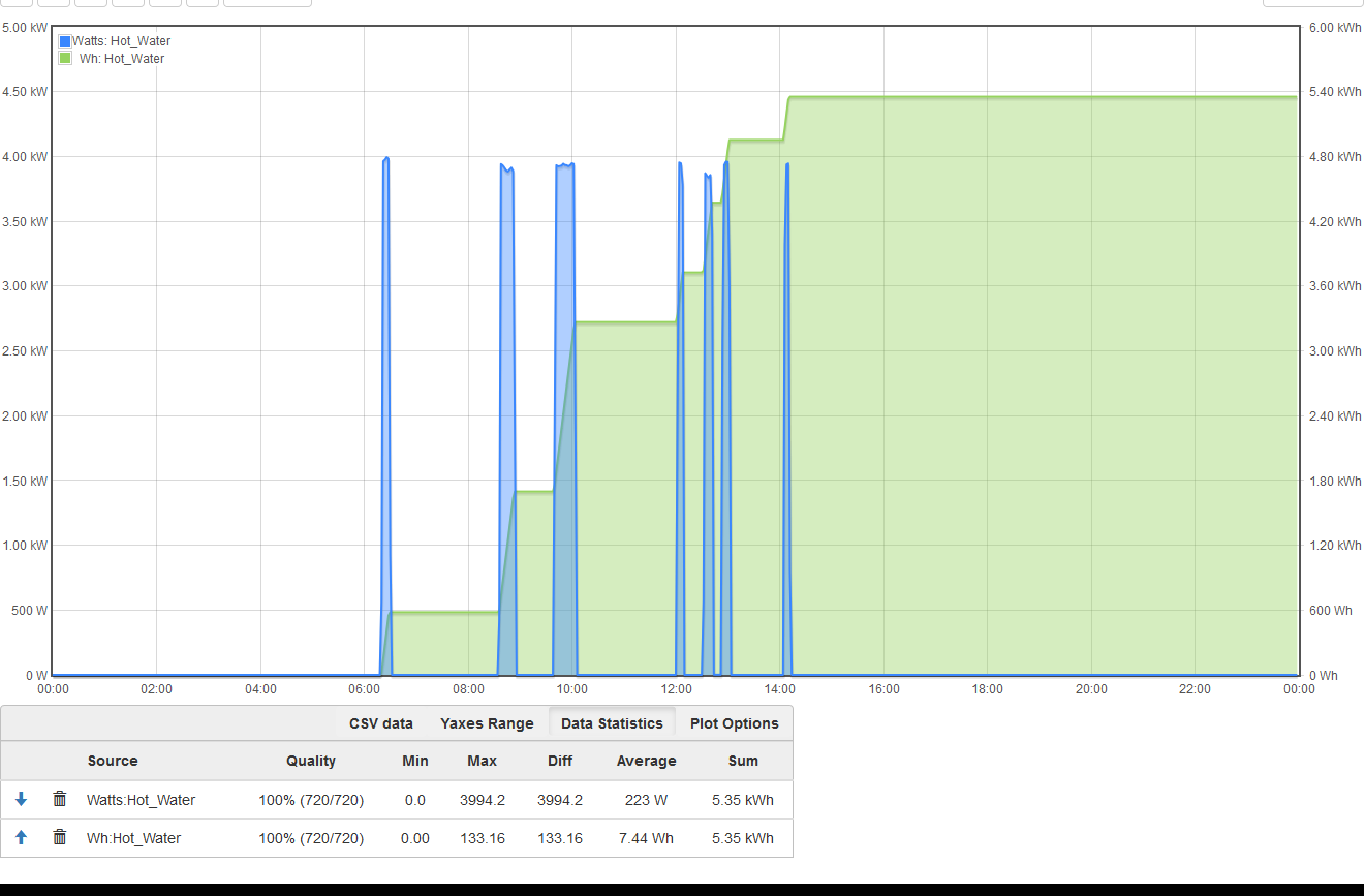
In the image below, I’ve isolated the power readings for a pair of clamps i have around the water heater circuit, for clarity. We can clearly see that the cumulative sum reports just above 3 kWh, but the actual sum is > 4 kWh.
How do you know the actual sum is >4kWh? It’s not obvious looking at the power graph. Just looking at the first cycle, it’s about 4.5kW and adds 1kWh. That would be a little over 13 minutes on, which looks plausible. So maybe show me the IoTaWatt graph with that cycle and the kWh plot together including the statistics lines?
If what you say is true, I’d need to see the query the grafana is using to get the kWh graph.
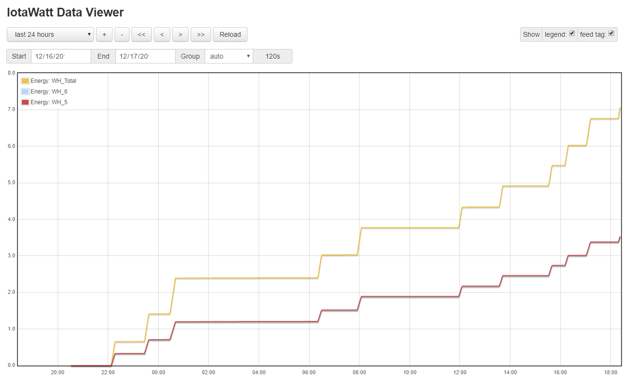
As an aside, you mentioned that you have clamps on the water heater. Water heaters usually need only one CT with “double” checked (Split phase 240V).
Thanks for the tip about the double clamps not being necessary on the water heater. Do you know if the same is true for double pole air conditioner circuits? and air handler (i.e. “furnace”) circuits?
Under plot options select the “accrue” box. It’s just the opposite of the old graph where accrue is the default and “delta” is an option.
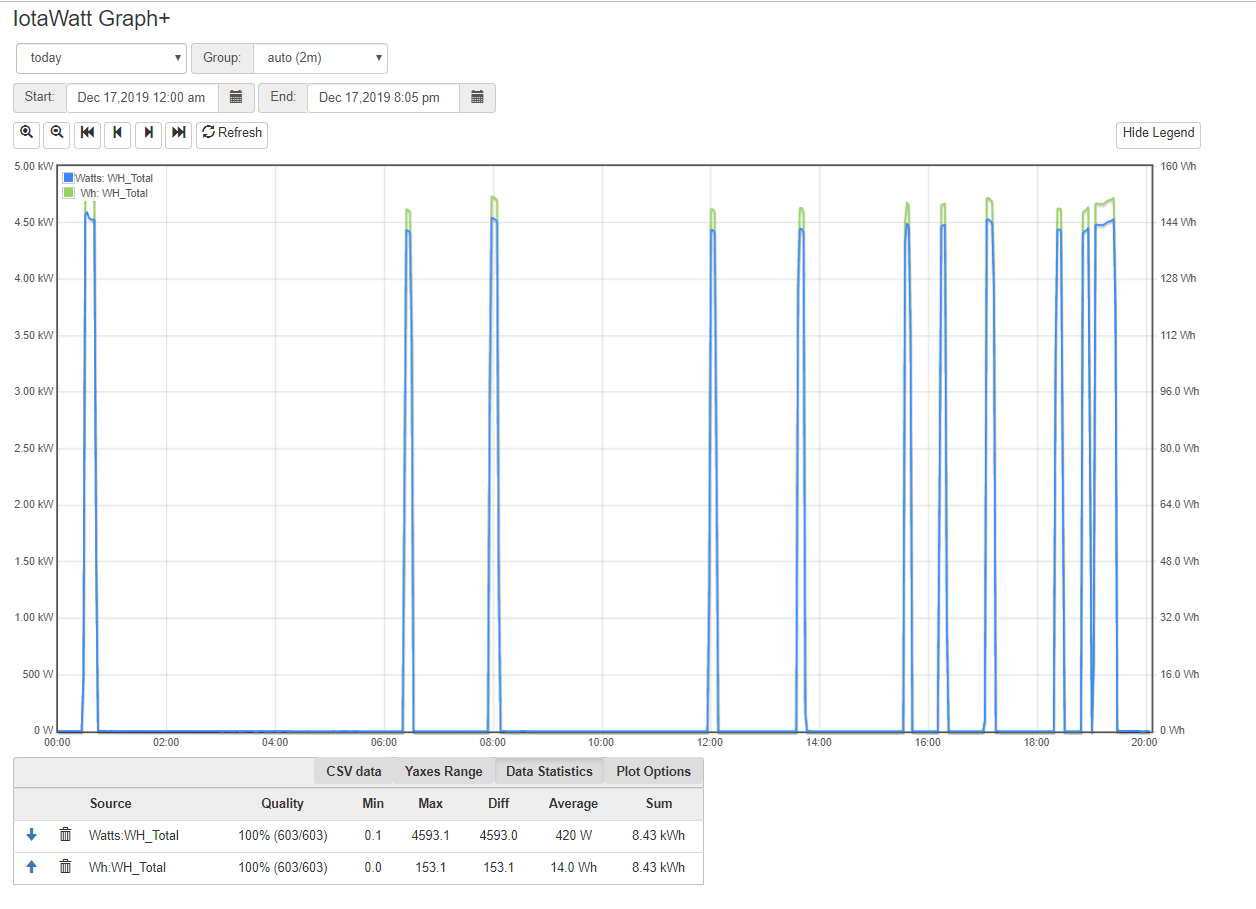
What’s in question is whether that lower left graph was correct. To know that, we need to see it along with this IoTaWatt graph for the same time period to see if kWh matches.
What’s in question is whether that lower left graph was correct. To know that, we need to see it along with this IoTaWatt graph for the same time period to see if kWh matches.
Oh yes, I admit that the left graph was not correct in value, I just wanted to take a step in the direction to see a graph that resembles its shape and that was the only way I was able to see it thus far.
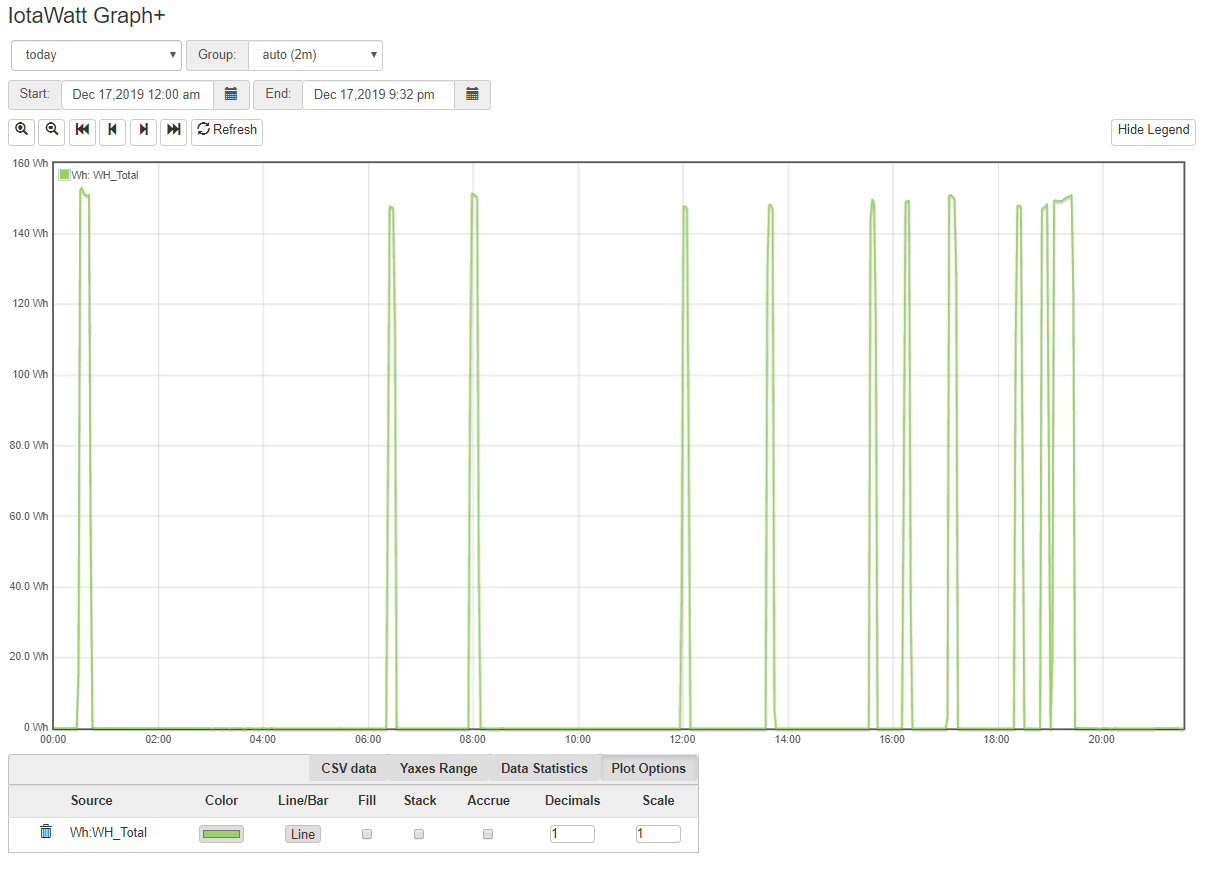
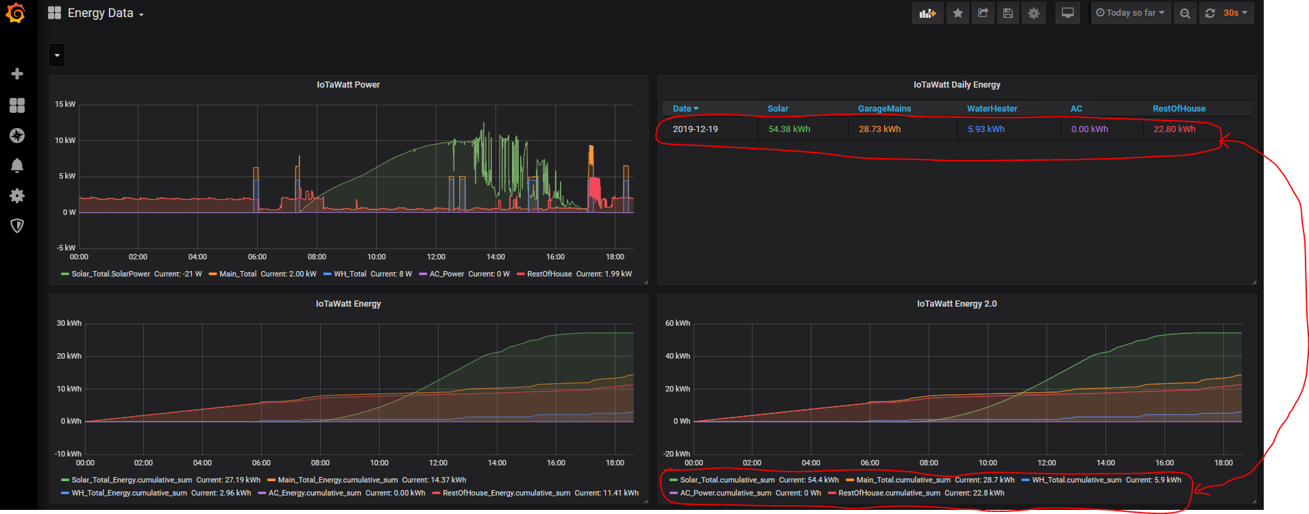
In the IoTaWatt graph above, the green line representing energy is what I would like to see in Grafana. How can I structure the query to do that? As it is, when I try to query my accrued energy in Grafana, I only get a graph that has the same shape as the power graph (similar to before I hit the “accrue” box in the IoTaWatt graph).
Edit:
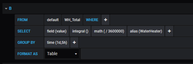
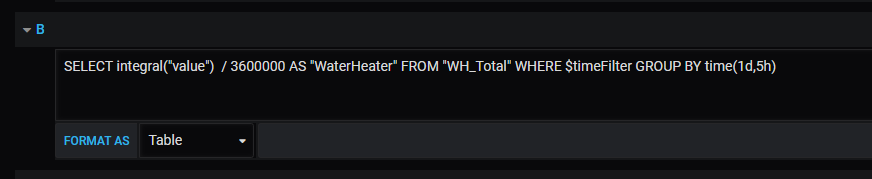
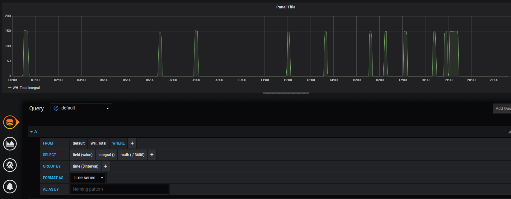
I don’t know if it helps or makes a difference, but I was able to get grafana to show the same values as IoTaWatt right before hitting the “accrue” button by using integral and division:
I don’t know offhand, but my sense is that it must be done in the query. Looking at the influxDB query functions documentation at:
I see there is a cumulative-sum function and looking at a grafana instance I see it is available under “transformations”. I’d bet a corned-beef sandwich that will do what you want.
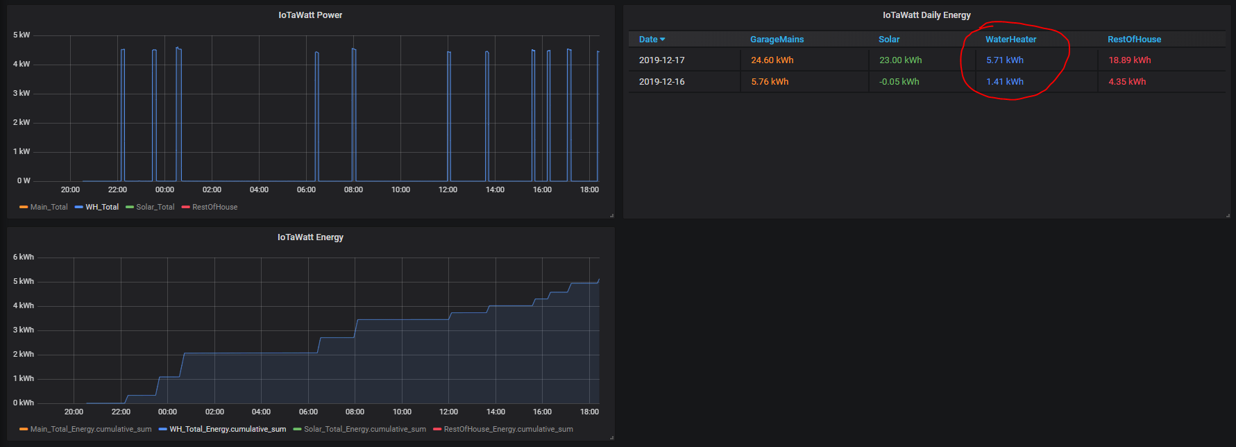
Thanks, yes cumulative sum is the function I was using to get a graph in that shape, it’s just I can’t get the proper factor of it to give me the correct values. Early on in the day it seemed that dividing by 2 got me closer since the value out of cumulative sum seemed to be double what the actual value us… but later on in the day it became apparent that just halving it is not enough as we have seen.
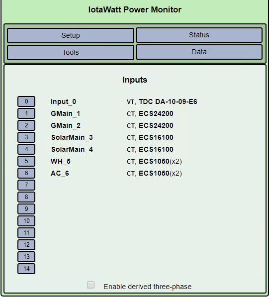
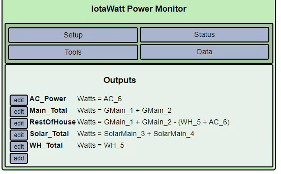
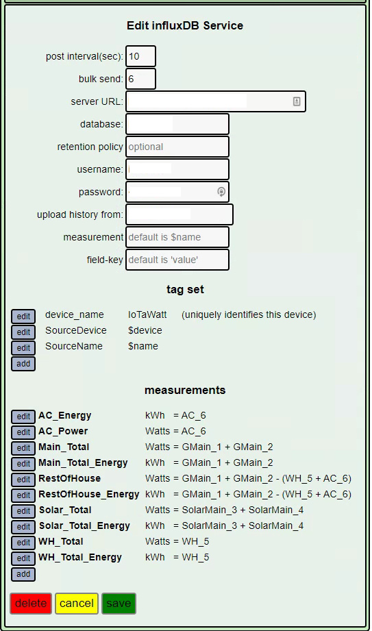
Sorry for the lack of consistency in the naming of inputs and outputs… when I was initially setting some things up with the IoTaWatt device I later realized what they actually meant but I had already started logging data… and didn’t want to mess up my existing reporting =|