I thought I would add this as it shows some of the options one has. This photo
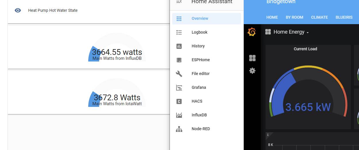
Is two browser screens, the black background is part of a Grafana dashboard that shows total load in KW. The other two guages are quick and dirty ones in Home Assistant, one showing the same thing data pulled from InfluxDB by Home Assistant, the other is a pull by Home Assistant directly from Iotawatt.
So three paths, same data (different values are rounding in the first case, and time frame in the second).
To give a flavor of what’s involved here’s the Home Assistant configuration for those last two pulls, this is from InfluxDB:
  - platform: influxdb
    host: localhost
    username: user
    password: pass
    queries:
      - name: Latest Main Watts
        unit_of_measurement: watts
        measurement: watts
        group_function: last
        where: '"ct"=''Main'''
        field: 'Watts'
        database: HA
This is a direct pull from IoTaWatt directly:
  - platform: rest
    resource: http://192.168.132.137/query?header=yes&select=[MainWatts.Watts.d1]&begin=s-1m&end=s&group=all
    name: IoTaWatt
    value_template: "{{value_json['data'][0][0]}}"
    json_attributes: 'data'
    device_class: power
    unit_of_measurement: "Watts"
    scan_interval: 60
  - platform: template
    sensors:
      iotawatt_main:
        value_template: '{{ state_attr("sensor.iotawatt", "data")[0][0] }}'
        unit_of_measurement: Watts
        device_class: power
        friendly_name: Iotawatt Main
This is wordy, but I hard coded it to make it more clear; there are examples of doing this with templates which just pull all the data directly, e.g.
https://community.home-assistant.io/t/adding-iotawatt-problem/150890/18
It uses loops to pull lots of data and build sensors for each (I have not tried the code there but it looks reasonable).
I wanted to see all these work, but my thinking is to always have Home Assistant pull from InfluxDB, and not direct, and let InfluxDB be the repository, handle retention and aggregation, etc. Or in my case it can combine data from two IoTawatt devices (e.g. calculate the “other” that is not monitored by summing all from both and subtracting from the mains).
But it’s nice to see how easy both are to get to work.