Pvoutput has different peak reading when compared to Graph+ ? Can anyone help me out with this? I have looked at all the settings in Pvoutput and can’t see anything out of the ordinary.
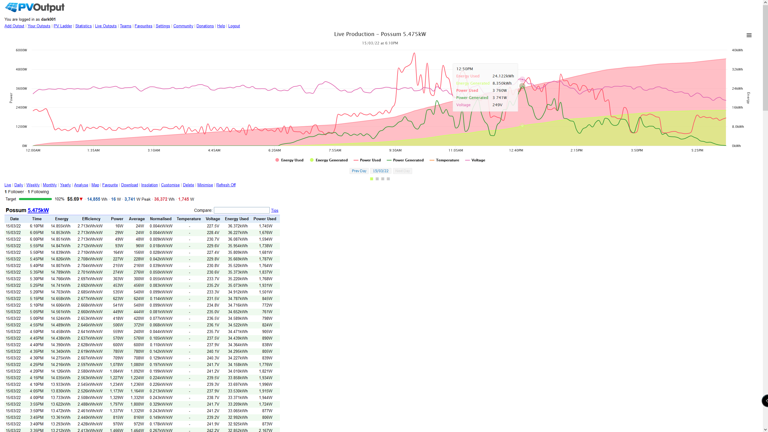
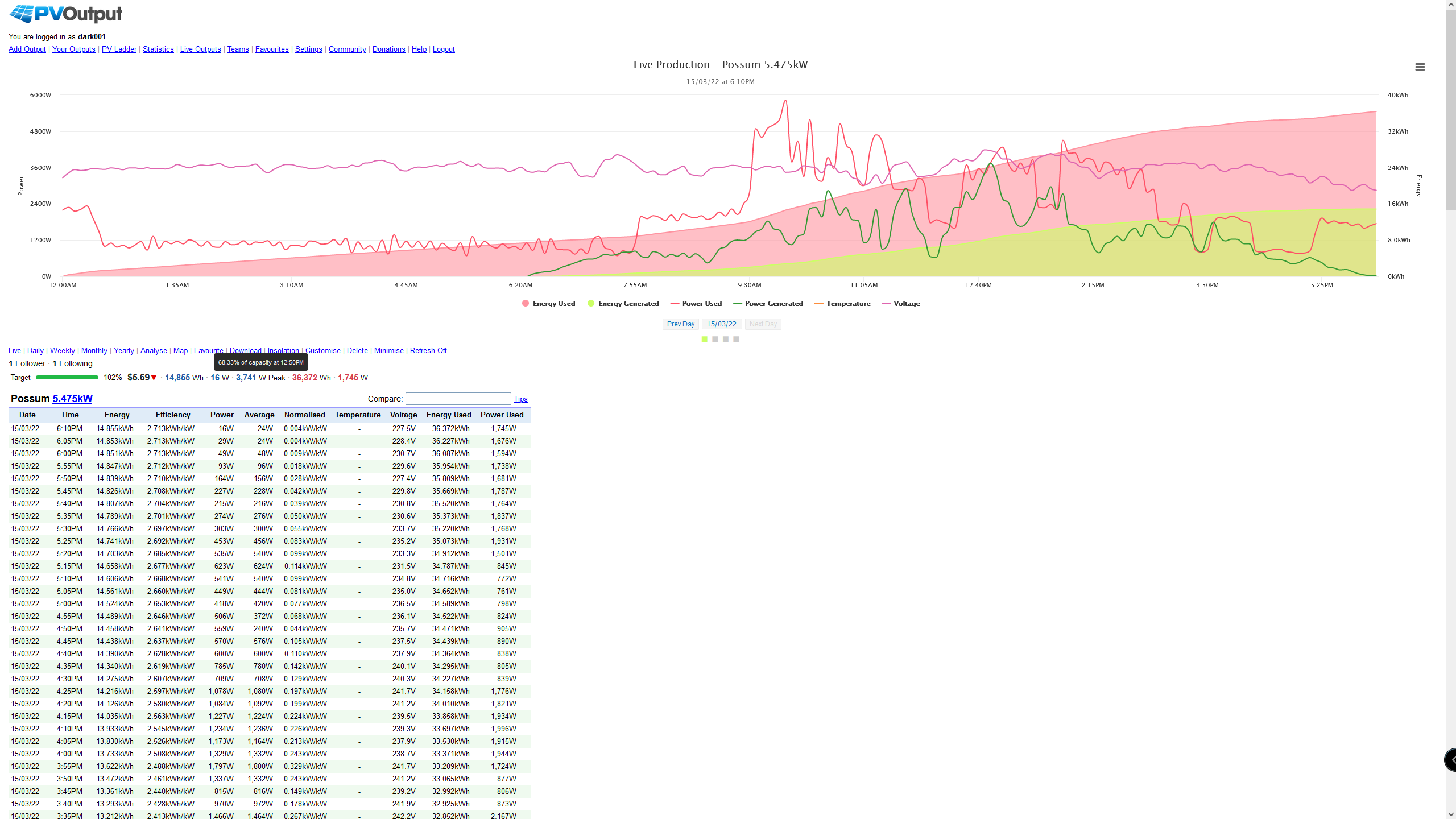

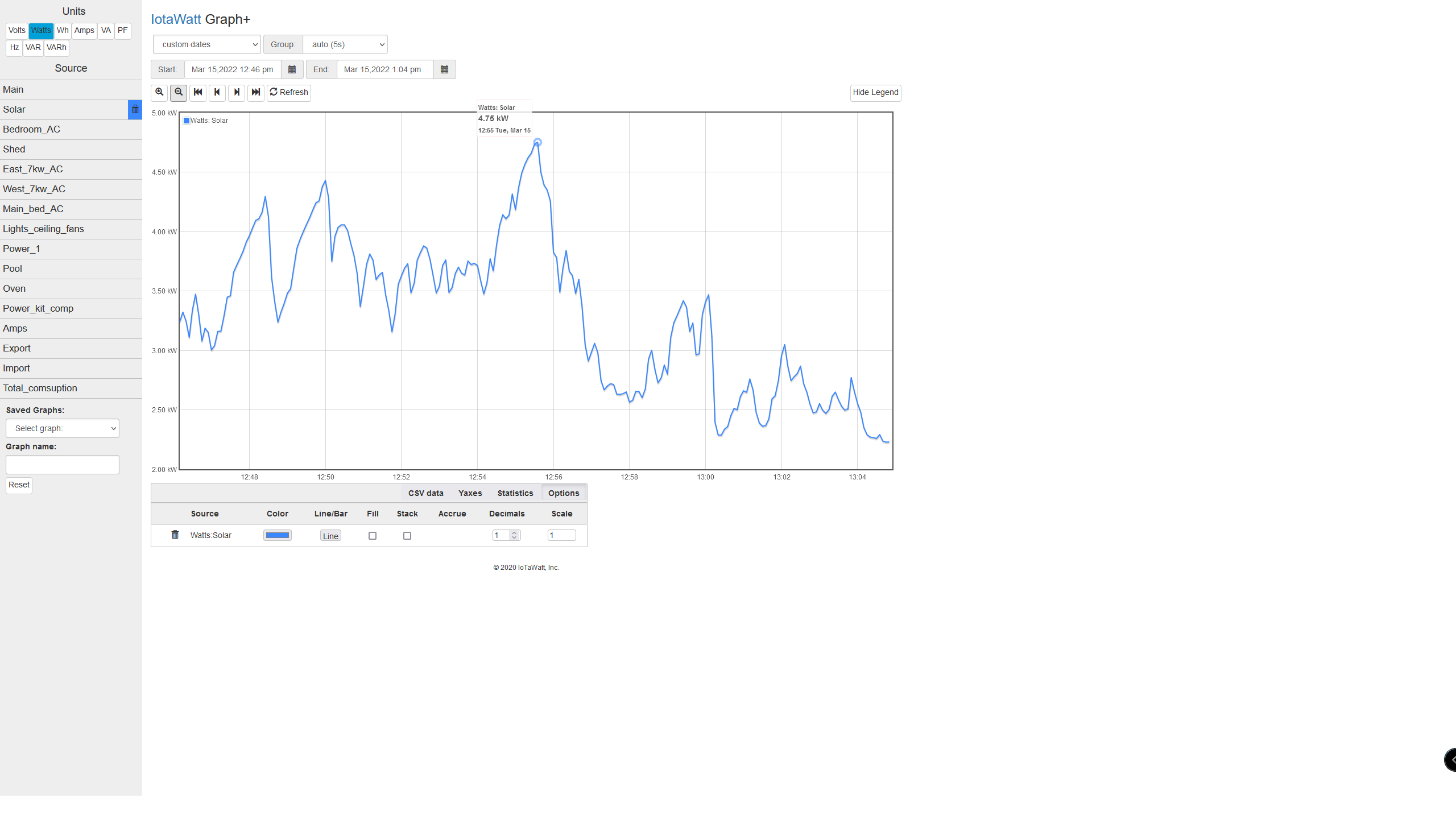
I think they are both correct. Data is uploaded to PVoutput every 5 minutes, so the power (Watts) is a five minute average. The Graph+ plot shown is based on two minute averages. Whenever the power is varying minute by minute, as in this cloudy day, those averages will be different. You can zoom in on the Graph+ plot and those will no doubt change and get even taller as you get down to the minimum five second interval data.
IMO what really matters is not the power (Watts) but the integral of power over time or Wh. Both PVoutput and Graph+ should agree exactly on this. You have the PVoutput accumulated “Energy Generated” in the gradually up-sloping light green plot. In Graph+ you can replicate that by adding a trace for Watts Solar in Wh units and checking the “accrue” box in options. To get an exact comparison, look at yesterday’s PVoutput total Power Generated and such a Graph+ for yesterday. I think they will be the same.
If you want to get another perspective on it, select hourly grouping in Graph+. The total energy will remain the same, but the hourly “peaks” will flatten as the data points become hourly average Watts instead of two-minute averages.
Ok. That clears it up. Thanks.