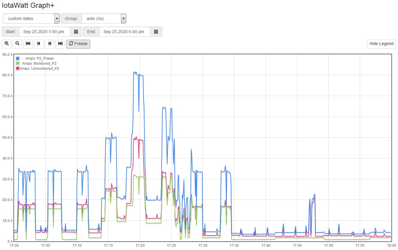
Only have about a weeks worth of monitored data now. I have 2 panels (1 100A and 1 200A) and I was trying to set up a couple of graphs to monitor the total amperage in both panels. I’ve attached 3 graphs showing a one hour window, a 24 hour window and a 7 day window. As you can see, the 1 hour graph clearly shows an 80+ amp draw on the 100A panel. As you stretch out the time frame the value changes to 55+ amps for the 24hr graph, then 25+ amps for the 7 day graph. Took me a few min to figure out what I think is going on, but I wanted to make sure I understood and possibly get help to figure out the best way to monitor these panels. What I think is happening is as you stretch out the time on the graph, you also stretch out the time on the grouping, going from 5sec to 2min to 20min. I’m guessing this grouping is averaging the values across that time making them somewhat lower than any peaks that might be occurring… I guess my question is how can you look at a month’s worth of data and determine the peak?
Dave
I’ve not tried to upload pictures before so I hope this works.