Add ability to alter or remove query limit.
Fix query output chunking issue with Node-Red
Various table additions/changes
Various contributed app changes
Incorporate latest asyncHTTPrequest
This is feedback on the new release. Not sure where to put it so, here it goes.
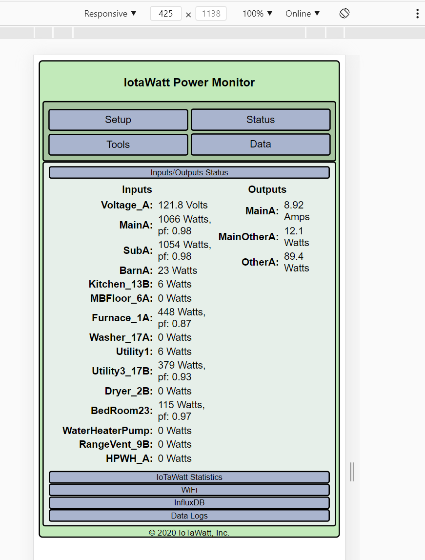
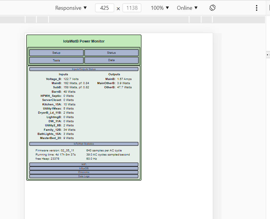
It looks like the rendering of the config app/status page has changed on mobile. I have one device on 02_05_11 and another on 02_05_12. The change to 12 increases the font size and makes the content take up all of the screen area, which is generally good. However, this also causes the circuits that display power factor to take two lines, which is also fine. But, the alignment now looks funny on my phone. I might get used to it (eventually) but it looks funny/wrong to my eyes on first glance. I believe I would try using valign=“top” for each of the in the Inputs and Outputs and/or add more padding in the rows. But, it is likely a fine balance between what looks good on the small screen vs the bigger ones.
If you are using Edge on Windows, you can use the F12 developer tools to see it on different mobile screen sizes by turning on device emulation.
I have not explored this, and @frogmore has not verified that is the problem. If it is, I will remove the change. I have no QC infrastructure, so this is what happens. Whack-a-mole.
This is a solution to the wrong problem. There have been many requests for various changes to the status display, for various reasons. The basic issue is that folks are using the status display as a dashboard. What is really needed is a status dashboard that can be somewhat configurable. It’s just not something I have the time to work on.
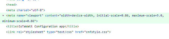
I explored a bit more today. Basically the max-width is 600px for the whole div but previously viewport was not set so it’s rendered too small on mobile devices. With the viewport set it’s rendered “properly” but a lot of mobile devices have smaller than 600px viewports so the table scaled narrower and messed up the formatting. I played with display:block a bit for the Inputs/Outputs to be responsive but need a bigger refactor to make it works right.
I like the bigger size better, i.e. using the whole screen width seems like a great idea. What I don’t like is that alignment of the table cells looks “funny”. I believe it is using center for valign. That would look okay if there were boxes around the cells or if there was more padding. The problem is that not all the rows have two lines. On a one-liner, I look directly to the right to see the number I really want to see (W). But when there is PF displayed, I have to remember to look up and right to get the number I want.
I was not able to capture the actual HTML that is being rendered, because there is no way to stop the update and I could not capture it. I didn’t try really hard.
I also agree with @overeasy that having an actual real-time status page would be an even better solution.