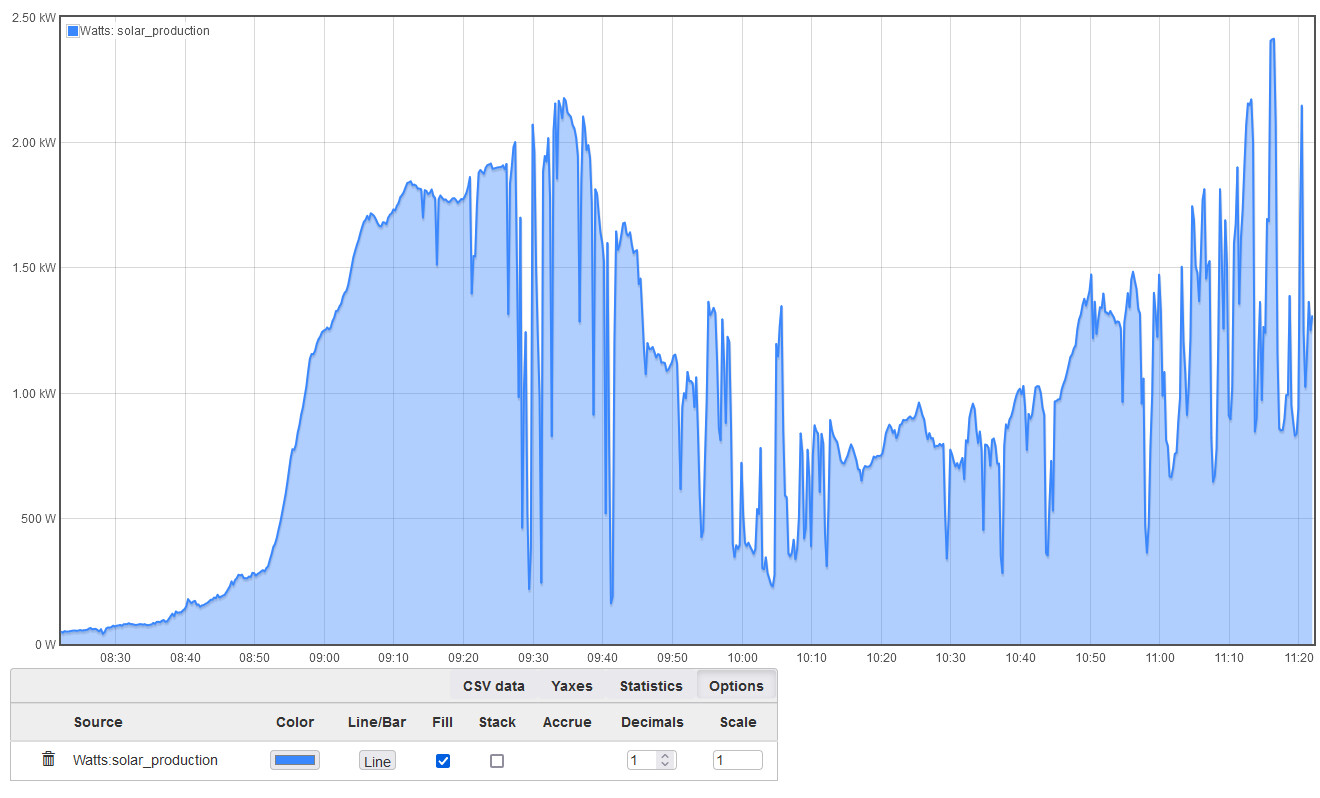
If I graph the watts of my solar production I get this:
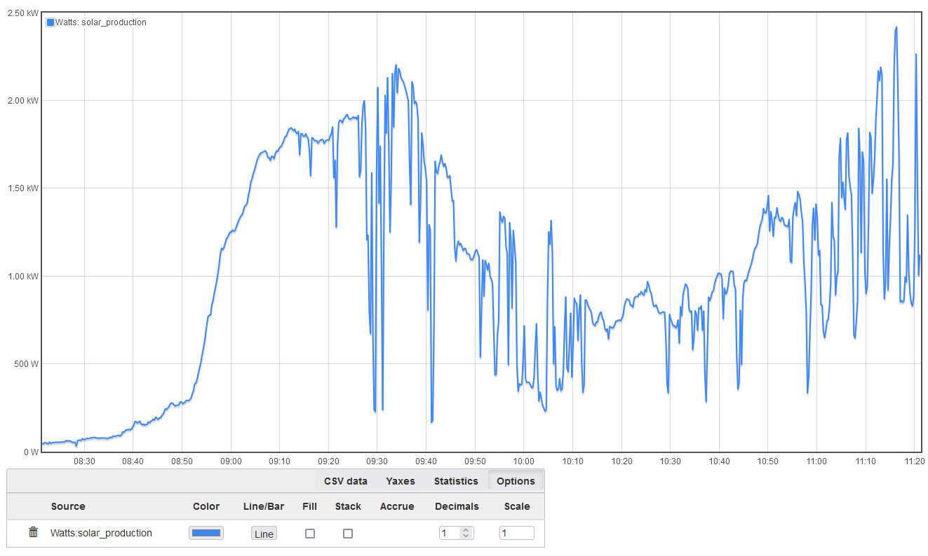
clicking the fill box I get this (basically the same graph):
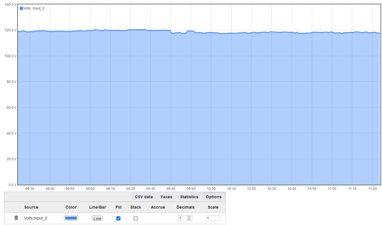
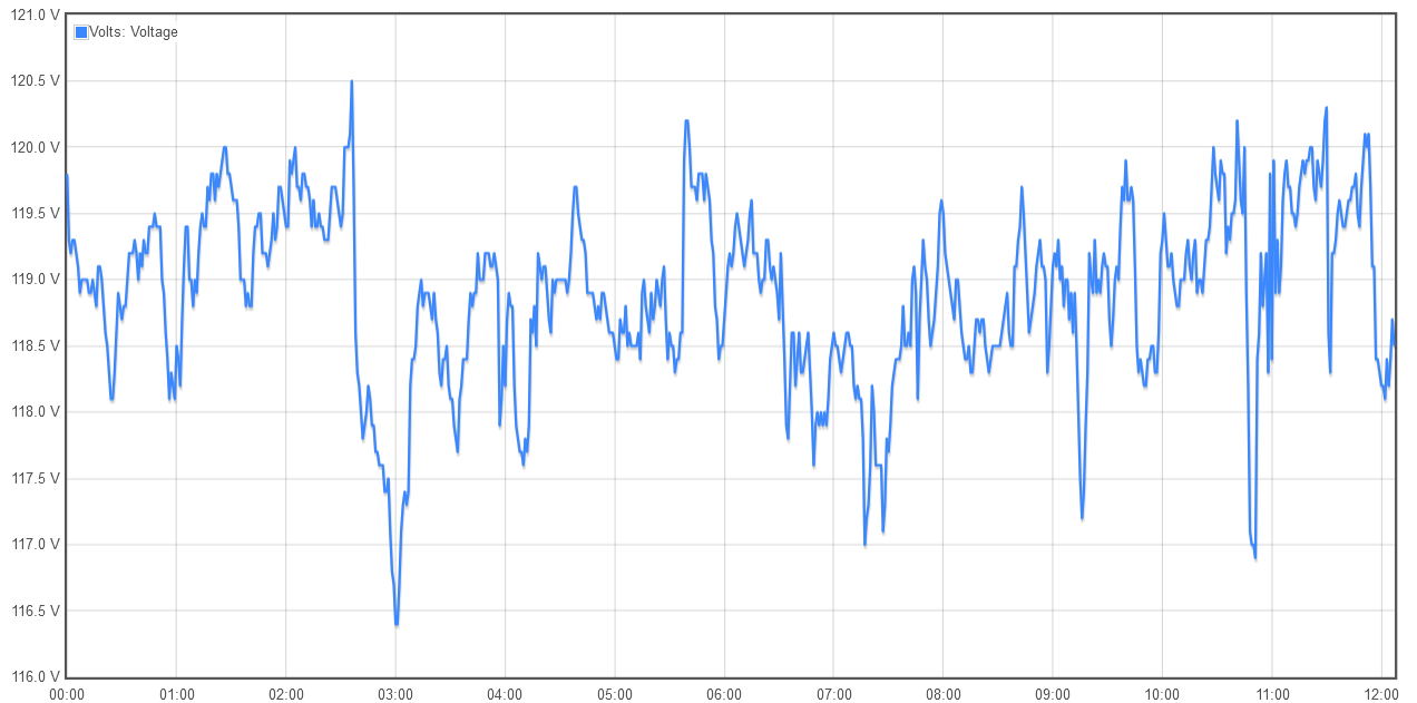
Now if I switch over to volts:

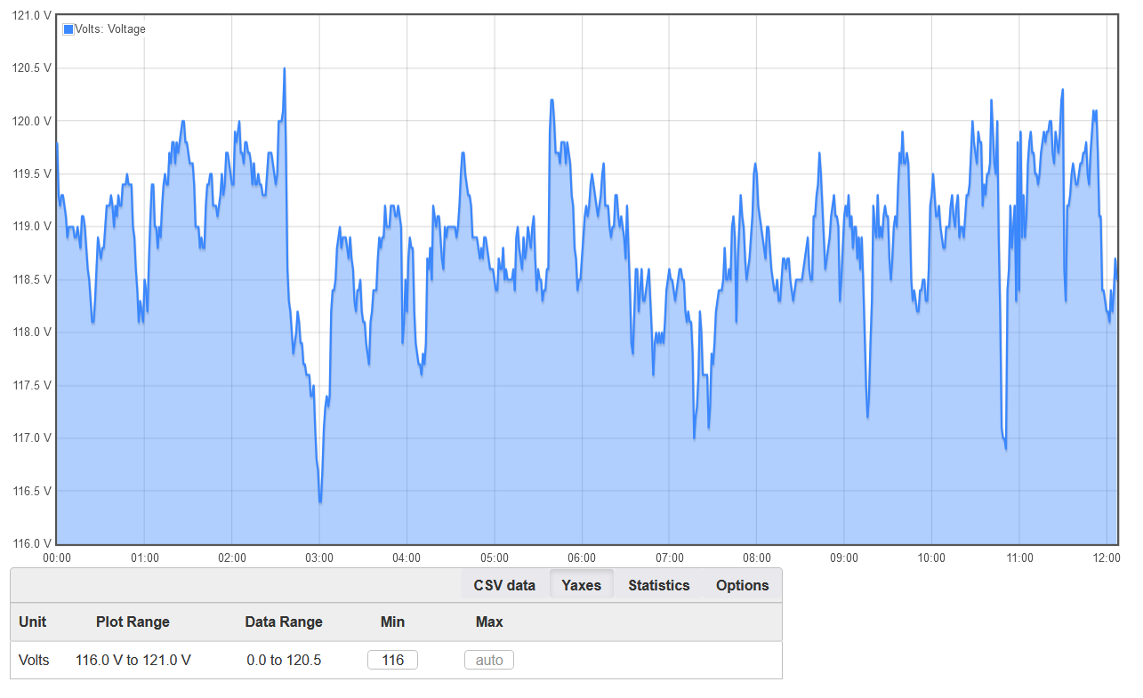
but if I tick the fill box I get this:
If I graph the watts of my solar production I get this:
clicking the fill box I get this (basically the same graph):
Now if I switch over to volts:
but if I tick the fill box I get this:
By design?
The watts graph auto scaled to start at 0 W because of your usage patterns.
When you tell it to fill, you are saying I want to share from current value to the bottom. It looks like graph+ is interpreting that to mean all the way to 0 instead of the bottom of autoscale.
Grafana does it the way you like. I normally turn that off, since I don’t think the shading helps on a line graph. Grafana used to do it by default, but seem to have changed that in the last couple of years.
OK…took me a minute to really read through and catch that but I see what’s happening.
Perfect, thanks, sorry for doubting you ![]()