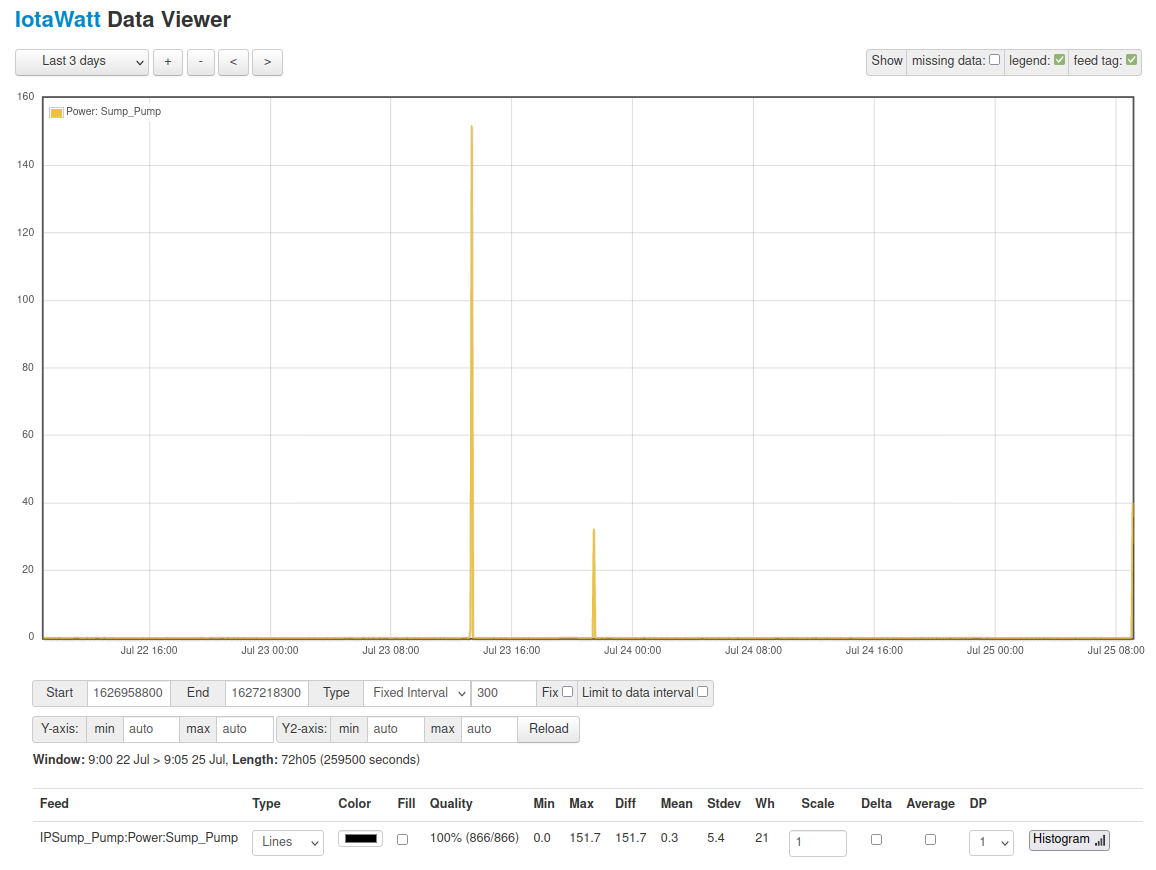
I’ve got things hooked up more or less how I want but I am seeing some strange readings on some circuits.
Here is one example - my ejector-pump which is the only thing on that circuit. Except in the graph its showing 30-150 watts!
I don’t think the CT is faulty because it shows a reasonable power use on the “status” page if I look when its running.

Why would the graphs be showing a completely different value than the actual usage on the graph?
The graph is Watts used over the last three days, so the data interval is 5 minutes. IoTaWatt query returns the average usage for each interval. The status display shows that the pump uses about 1160 Watts when operating, so lets say when it runs for one minute. The five minute average would then be 1/5 or 232 Watts.
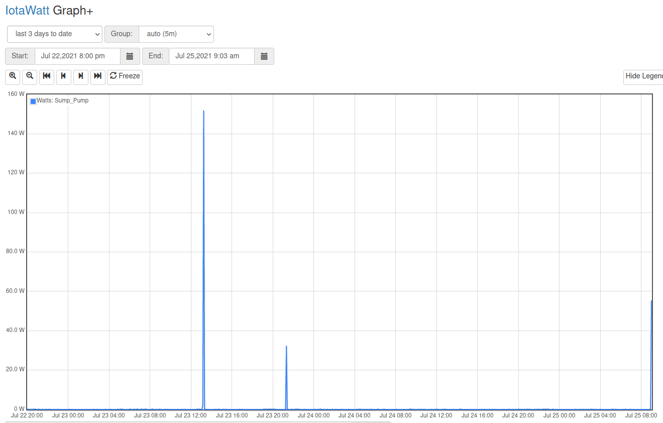
You can zoom in on those pump events by selecting with the cursor. If you select a slice that is an hour or less, the interval will be 5 seconds and most of the intervals should show the “all on” average of 1,160 Watts.
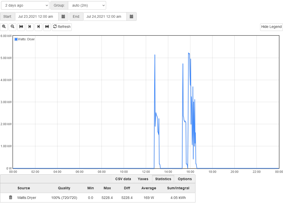
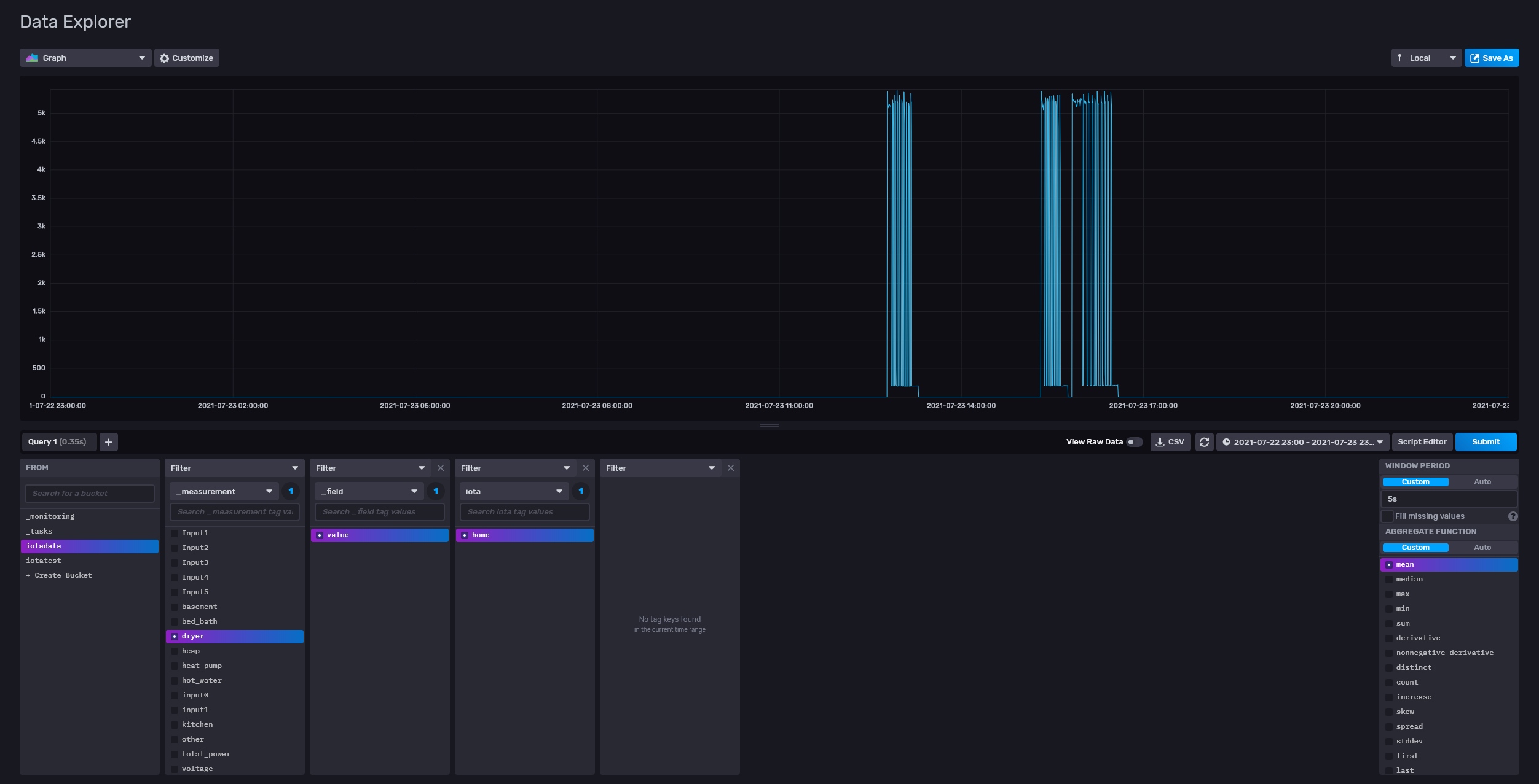
Here’s my clothes dryer two days ago. We used it twice.
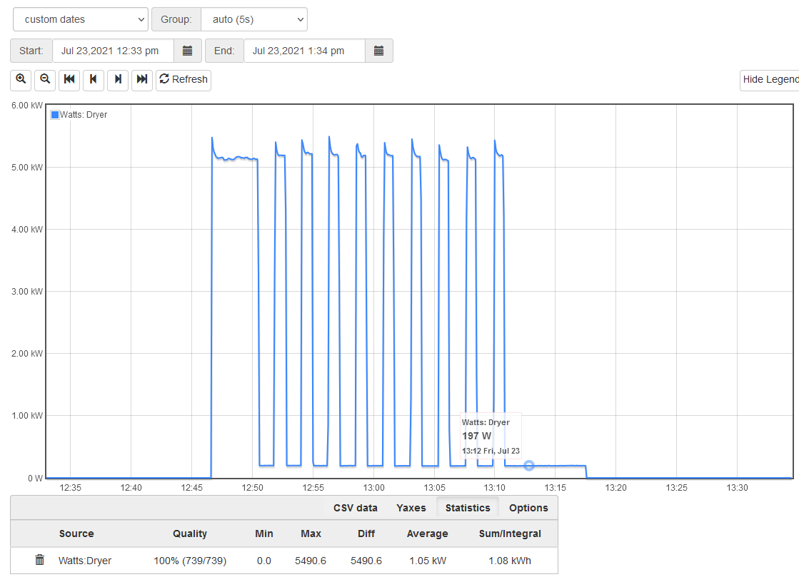
You can see that it hits the 5kW or so Watts in the beginning of the cycle when the heater runs longer than the 2 minute interval of the plot, but then seems to drop to around 2kW. Zooming in we see that the heater always draws 5kW but that after the initial heating, it cycled for less than a minute per cycle and so averaged 2kW each 2 minute interval. You can also see where I put the cursor over the baseline to show that the tumbler motor uses about 197Watts.
Typically, looking at the absolute power draw of an appliance requires viewing at an interval that is less than the typical duty cycle run time.
1 Like
Ah. I don’t suppose there is a way to increase the resolution of the larger plot?
It’s a pixel thing, and also an issue of data set size. Graph+ shoots for around 720 intervals per plot and adjusts the grouping to achieve that. Consider your three day plot. There are more than 50,000 intervals at 5 second grouping. For even the smallest of graphs (plotting one or two items) would generate about 1.5MB of data. That would take awhile to transfer, and then only the most capable computers would be able to efficiently process that data.
And obviously, you would need a really big, very high resolution screen to get 50,000 pixels across the plot. My pretty good primary desktop monitor has about 111 horizontal pixels/inch, so a 10 inch plot might have 1,110 pixel resolution. If more than that number of datapoints are to be plotted, the plotting software and/or video driver are going to have to find a way to represent that.
For what its worth, here’s my one day dryer plot above using influxDB plot at 5 second intervals (powered by AWS servers and my 8GB desktop, output through to a 2560 monitor in full screen mode).
IoTaWatt doesn’t have the horsepower to do this, but you can upload to influxDB and get higher resolution plots depending on your display device.