I have just spun up a new version on a raspberry pi and loaded some data to it.
This is running InfluxDB V2.6.1
And Grafana OOS 9.4.3
I tried using both the string manipulation and the date truncate method and it still ignores the query settings and obeys whatever I set in the drop down menu? Really odd but I’m not too worried for now as the relative time setting seems to do everything I need. For now at least.
That is actually the way it is documented to work, so not really odd.
I suspect @wallacebrf has something different going on. Not sure what, but providing the JSON and more information would shed some light and perhaps be a case study for the Journal of Irreproducible Results.
1 Like
here is a link to my entire JASON file
perhaps that will help?
1 Like
Mystery solved. You have this:
      "title": "KWH Per Day Since Start of Month",
      "type": "barchart"
Bar charts do not have the concept of time, so don’t respect the time window that a Time Series does. You can create a Time Series that displays bars along a time line, which is what I thought you were using. But, you appear to be using the newish Bar Chart which is in Beta. This method displays as much (or little) data as the query returns. So, if you want a bar chart, you do not need to specify relative time. I think that is a good option for daily power usage, so thanks for sharing your JSON.
1 Like
The documentation on Grafana is not clear on which to use when. It seems like the intention is for barchart to be used in non-time series data, but it now appears to support time series data well enough.
This is from an earlier version which did not appear to work so well with time series data.
How to display time series data as a bar chart in Grafana? - Grafana / Bar Chart (BETA) Panel - Grafana Labs Community Forums
glad that was able to shed some light on the issue, and i agree it is good to know the bar chart behaves this way
Thanks @frogmore I’ve been reading up a bit and think I understand a bit more now. Although I am confused as to why the range function is in the query at all given that grafana basically ignores it?
Anyway, moving forward. I have got the days to display properly by adding a Time Shift of 1d to the Query options.
Not ideal but at least it’s working.
oops. Just realised. It’s shifted the wrong way. It’s now 2 days out.
Anyone know if and how I can set negative time shift?
From the manual:
duration
(Required) Amount of time to add to each time value. May be a negative duration.
1 Like
Grafana doesn’t ignore it. There are two parties that have work to do to get what you want.
First party is InfluxDB. You have to tell it what data you want (or it will return all data it has, which will take a long time).
Second party is Grafana. You tell it the timescale you want (for time series data) with the selection for the dashboard.
The data that gets displayed (for time series) is the intersection of the data that was provided with the time range that is being displayed.
If you don’t line them up, you will have a lot, possibly all, of the data thrown away. Grafana provides a handy way to tell InfluxDB to use the interval that the user has specified.
v.timeRangeStart and v.timeRangeStop
You should use that unless you are trying to do something special. If you are doing something special, you have to figure out how to tell both parties how to do the special thing you want. This is not always easy and you sometimes have to be very creative to get what you want.
1 Like
Tagging in on this thread as it’s pretty close to what I’m trying to accomplish. I previously had this working, but everything’s new again with flux. My goal is to create a “this year” graph with a bar for solar generated each month. I’ve got a working chart for the “this month” version, but for some bizzare reason when I adapt the code over to yearly, the numbers stop making sense. Here’s my query:
import “timezone”
option location = timezone.location(name: “America/Los_Angeles”)
from(bucket: “energybucket”)
|> range(start: v.timeRangeStart, stop:v.timeRangeStop)
|> filter(fn: (r) => r[“_measurement”] == “iotawatt”)
|> filter(fn: (r) => r[“sensor”] == “Solar”)
|> filter(fn: (r) => r[“_field”] == “kWh”)
|> aggregateWindow(every: 1mo, fn: sum, createEmpty: true, timeSrc: “_start”)
|> map(fn: (r) => ({ _value:r._value, _time:r._time, _field:“Solar” }))
For efficiency, I’ve got a task downsampling and converting from my original “watts” data to kwh per hour. Here’s the task code:
option task = {name: “1H Downsample”, every: 1h}
from(bucket: “iotabucket”)
|> range(start: 2023-05-26T00:00:00+10:00)
|> filter(fn: (r) => r[“_measurement”] == “iotawatt”)
|> filter(fn: (r) => r[“_field”] == “Watts”)
// strip extraneous tags
|> keep(
columns: [
“_time”,
“_field”,
“_value”,
“device”,
“sensor”,
“_measurement”,
],
)
// rename a field
|> set(key: “_field”, value: “kWh”)
// W → Wh: integral is better but mean ok
|> aggregateWindow(fn: mean, every: 1h, createEmpty: false)
// Wh → kWh
|> map(fn: (r) => ({r with _value: r._value / 1000.0}))
|> to(bucket: “energybucket”, org: “home”)
Here’s what I have so far:
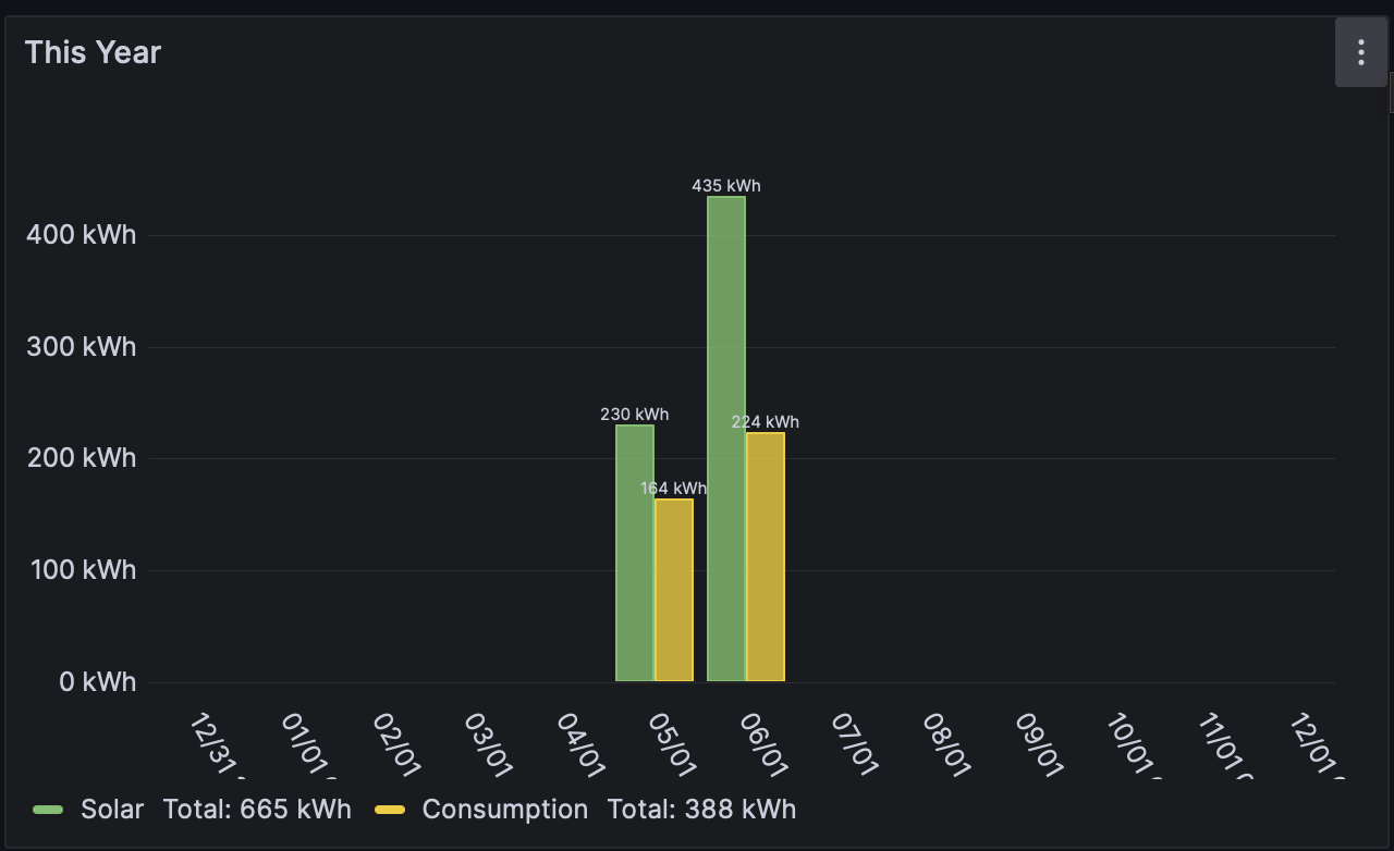
As an example, last month’s solar generated was actually 702Kwh, but the chart’s calculating it at 230kwh. What’s really bizzare to me is that I adapted this query from my monthly chart, and the values there are correct.
The actual cumulative value for solar should be about 1.15Mwh.
Any idea what I’m doing wrong?